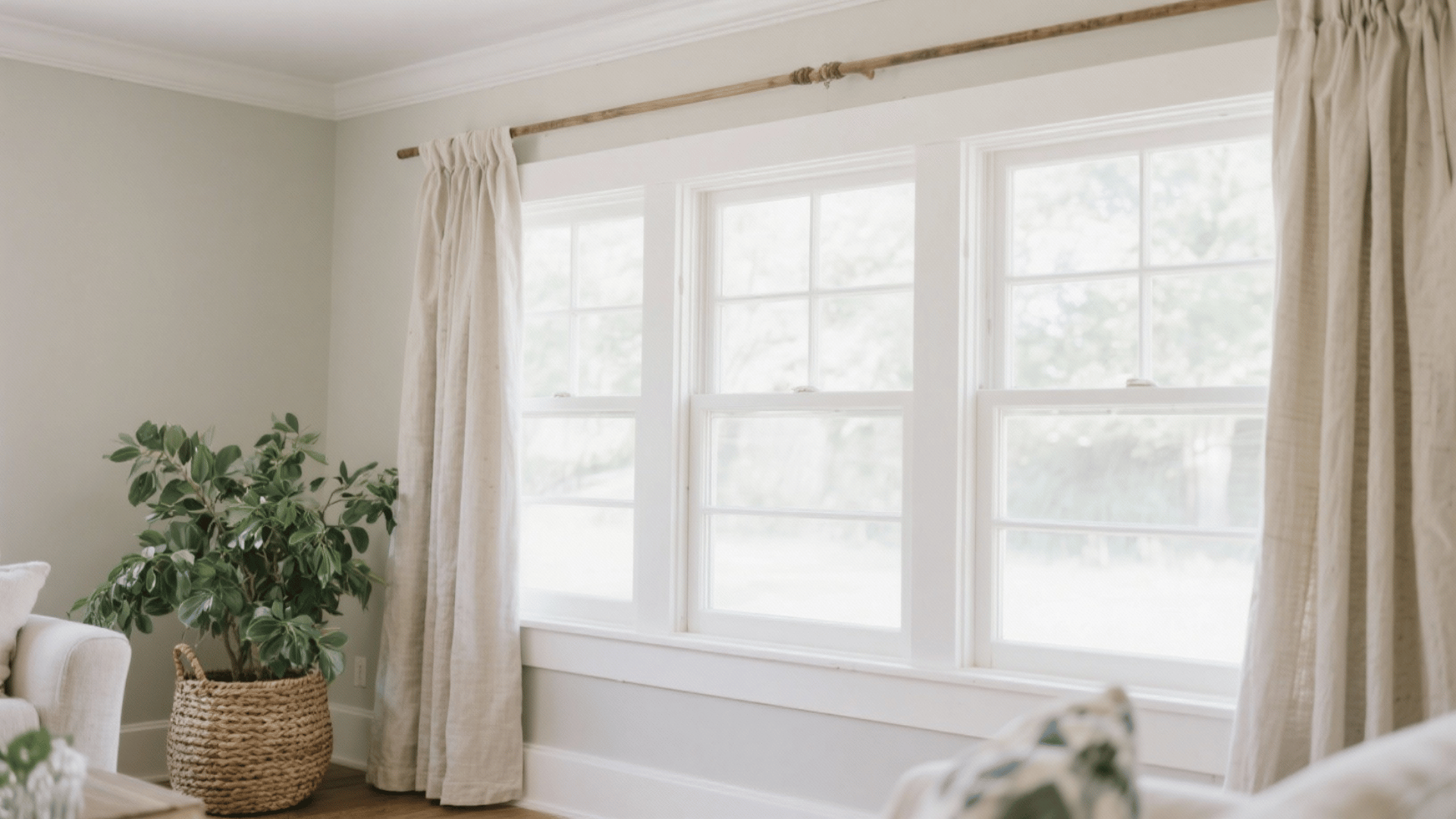
Choosing colors can completely change how a space or artwork feels. The right mix can make something look calm, bold, or full of life, while the wrong one can feel messy or dull.
That’s why understanding color schemes is so important in home decor, art, and design.
One of the most balanced and creative ways to use color is through a split complementary color scheme. This palette uses three colors that offer both contrast and harmony.
By learning how split complementary colors work together, anyone can create designs that stand out beautifully without clashing or overwhelming the eye.
What is the Color Scheme?
A color scheme is a planned combination of colors used together to create a specific look or mood in design. It helps maintain visual harmony, making spaces, artworks, or digital projects feel balanced and appealing.
There are several types of color schemes, each offering a unique way to balance contrast, harmony, and visual appeal.
1. Complementary Color Scheme
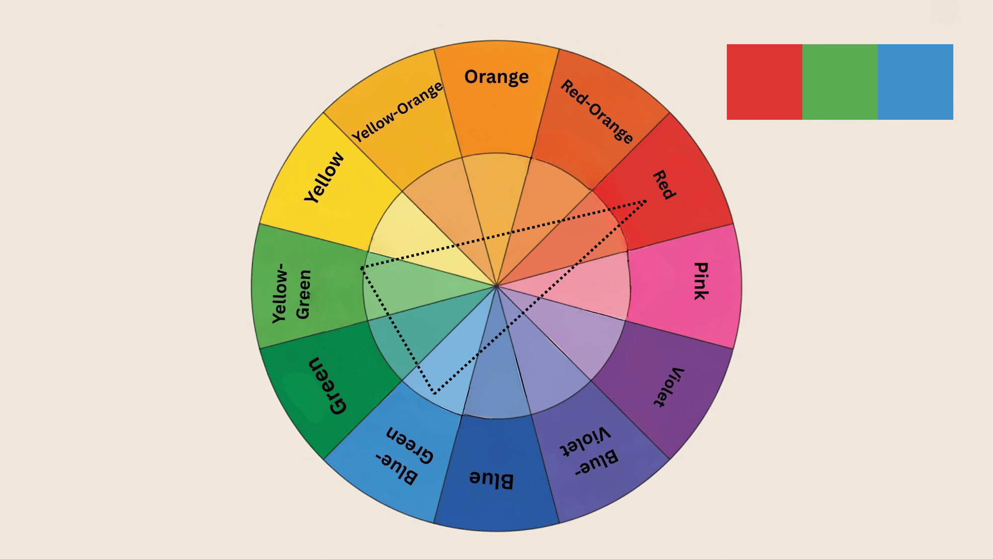
A complementary color scheme pairs two colors directly opposite each other on the color wheel, such as red and green or blue and orange.
This contrast creates a bold, dynamic effect that instantly draws attention. Designers use it to highlight focal points or create high energy in a room.
When balanced carefully, it offers a strong visual impact while maintaining harmony through the right mix of warm and cool tones
2. Triadic Color Scheme
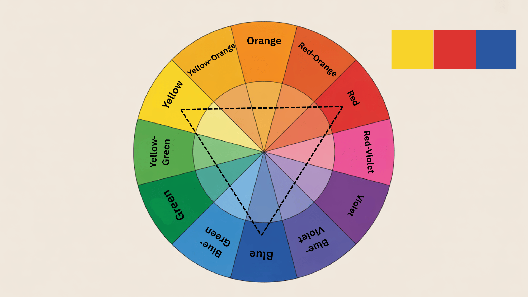
A triadic color scheme uses three colors evenly spaced around the color wheel, such as red, blue, and yellow.
This palette delivers a lively and balanced feel, full of energy and contrast. It works best when one color dominates while the other two serve as accents.
The triadic scheme is great for playful, creative interiors or graphic designs where variety and visual harmony are both essential.
3. Analogous Color Scheme
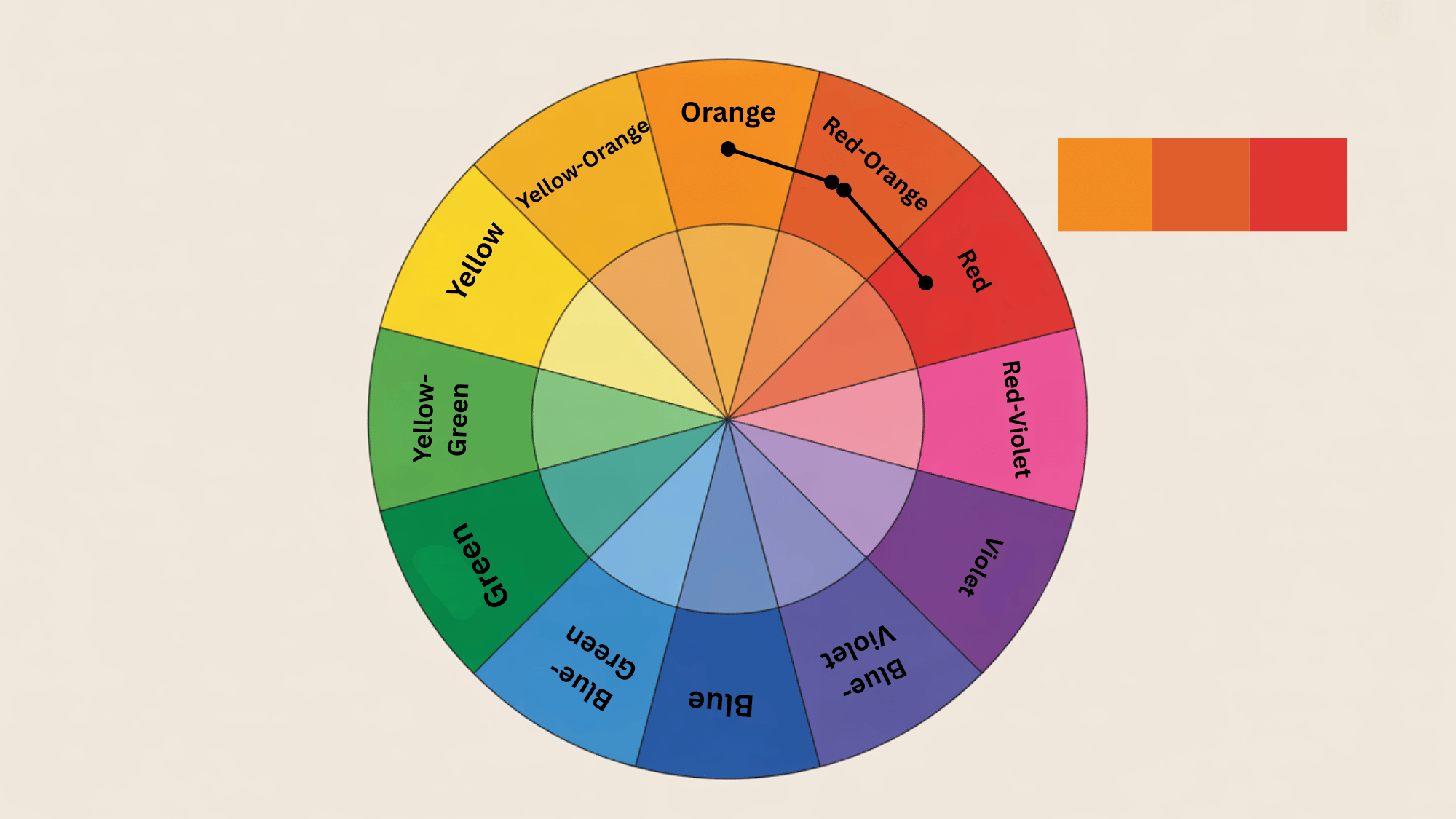
The analogous color scheme uses three or more colors that sit next to each other on the color wheel, such as blue, blue-green, and green.
It creates a smooth and natural transition between hues, often seen in nature. This palette gives a soft, harmonious effect that’s perfect for cozy and relaxing environments.
It’s commonly used in living rooms or serene designs where subtle color blending improves visual comfort.
4. Monochromatic Color Scheme
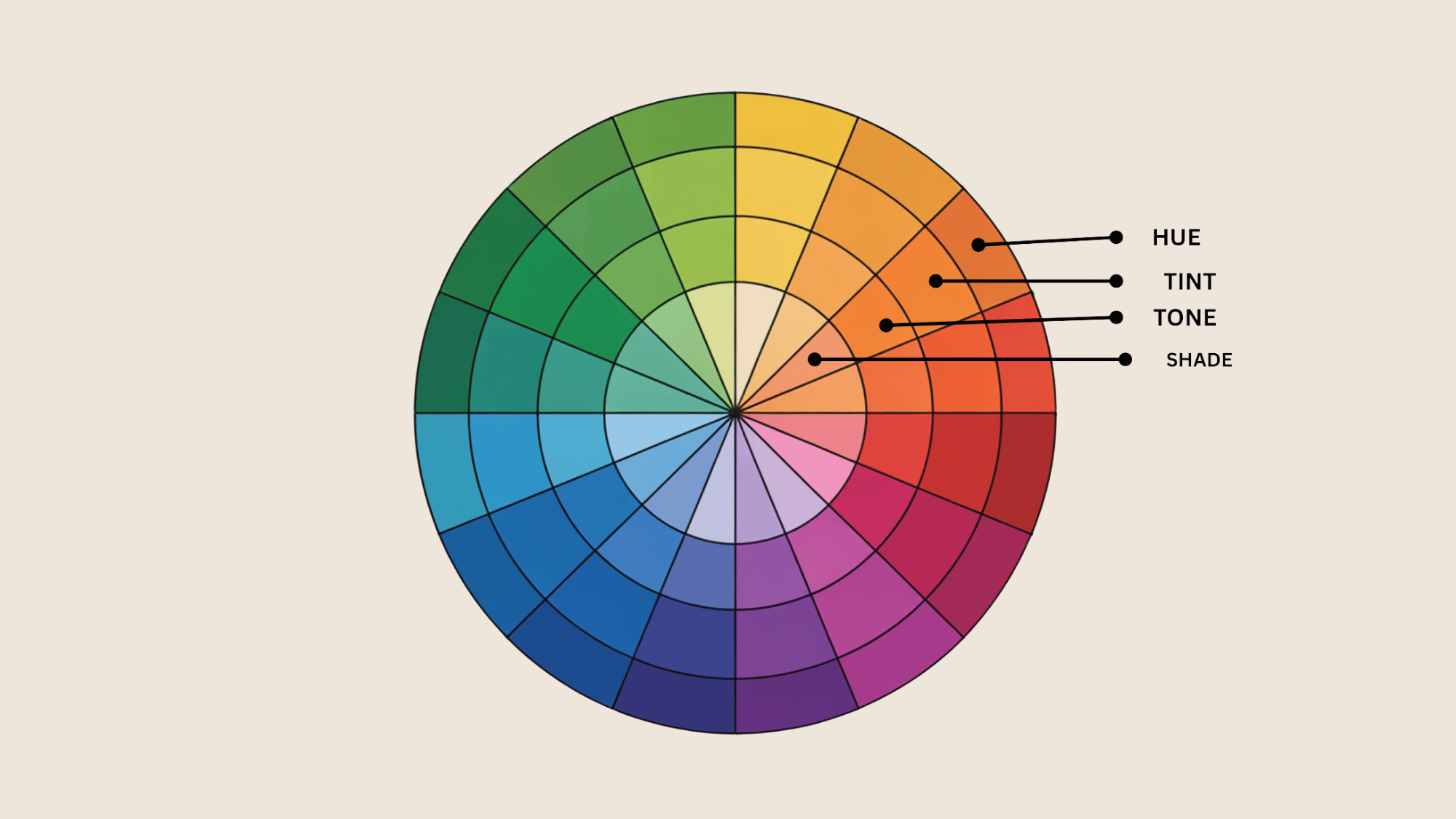
A monochromatic color scheme uses different shades, tones, and tints of a single color. It creates a clean, simple, and unified look that’s easy on the eyes.
This type of scheme works beautifully for minimalist designs or calm interior spaces like bedrooms.
By adjusting brightness and saturation, designers can add depth and variety without introducing new hues, keeping the overall appearance stylish and balanced.
What is a Split Complementary Color Scheme?
A split complementary color scheme brings balance without overwhelming the eyes.
Pick one base color, then add the two shades flanking its opposite on the color wheel. This approach softens harsh contrasts while keeping things interesting.
The result feels lively but still coordinated; perfect for kitchen spaces that need visual appeal and calm comfort. Here are the essential split-complementary combinations:
- Red + yellow-green + blue-green
- Orange + blue-green + blue-purple
- Red-purple + yellow + green
- Red-orange + green + blue
- Yellow-green + purple + red
- Yellow-orange + blue + purple
- Yellow + red-purple + blue-violet
- Green + red-purple + red-orange
- Blue + red-orange + yellow-orange
- Blue-green + red + orange
- Blue-purple + orange + yellow
- Purple + yellow-green + yellow-orange
Using Split Complementary Color Scheme for Home Decor
Creating different color schemes allows designers to experiment with balance, contrast, and mood, helping them craft visually appealing and unique designs.
1. Coral + Teal + Soft Green
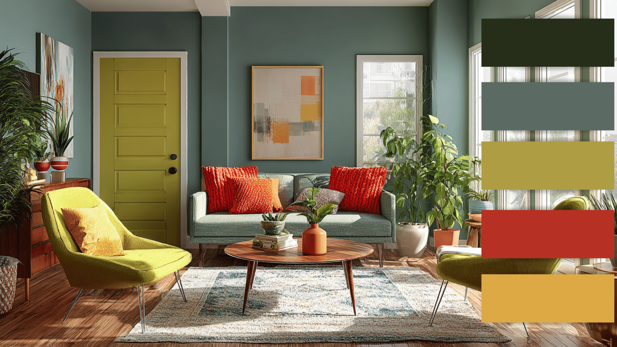
This color scheme blends the warmth of coral with the freshness of soft green and the calmness of teal.
It’s ideal for lively home spaces like living rooms or kitchens, where energy meets comfort. Coral can be used as an accent through cushions or art, while the green tones balance it out on walls or decor.
They create a vibrant, refreshing, and welcoming atmosphere that feels both modern and natural.
2. Grape Purple + Slate Blue + Warm Orange
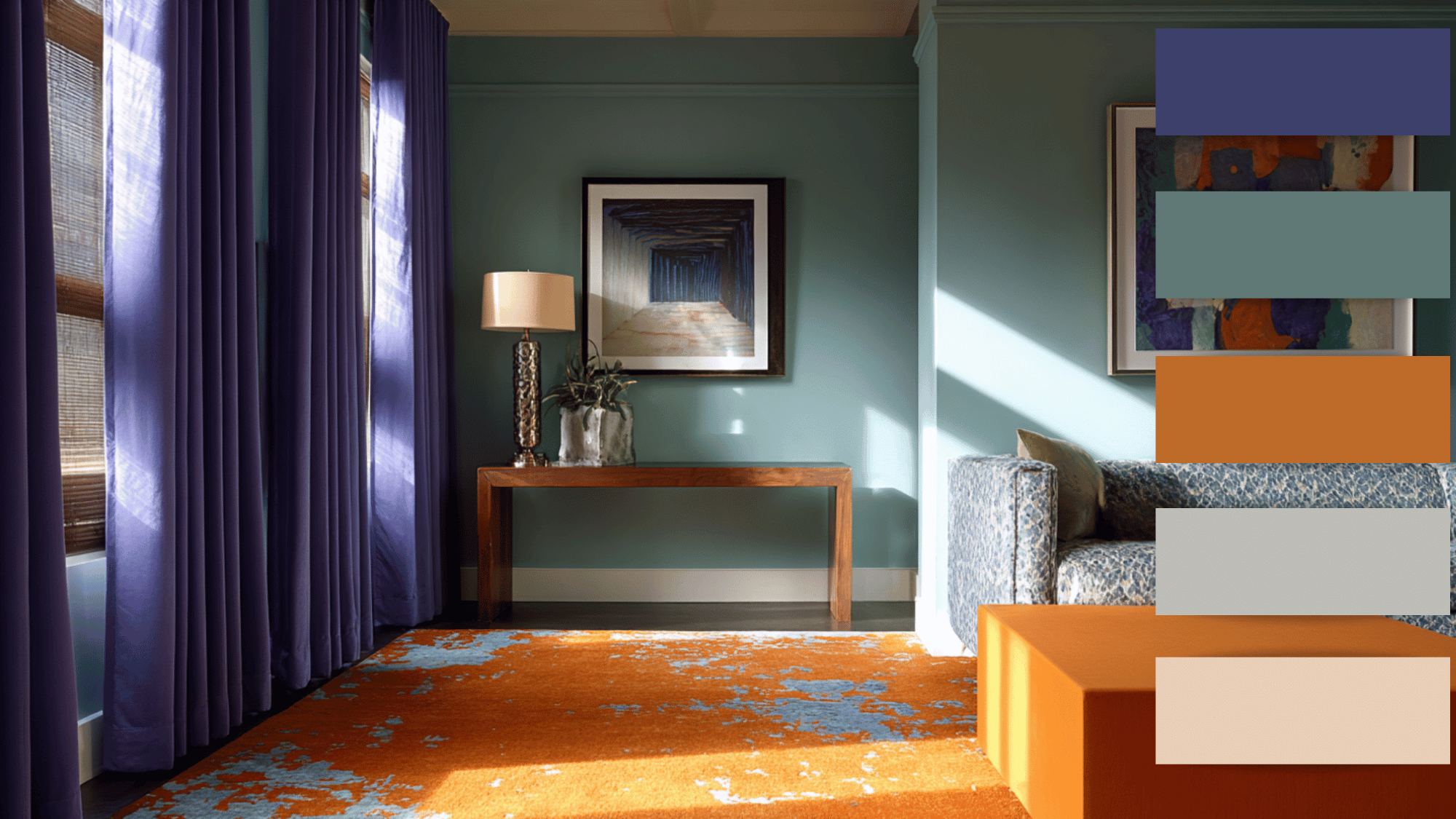
This mix combines the boldness of orange with the cool depth of slate-blue and grape-purple.
Perfect for eclectic or creative interiors, this palette adds drama and modernity. Warm orange accents bring warmth, while the blue tones introduce calm.
You can use any blue-purple on textiles or wall paint and orange on accessories for a stylish, balanced space that feels energetic yet composed.
3. Burgundy + Mustard Yellow + Sage Green
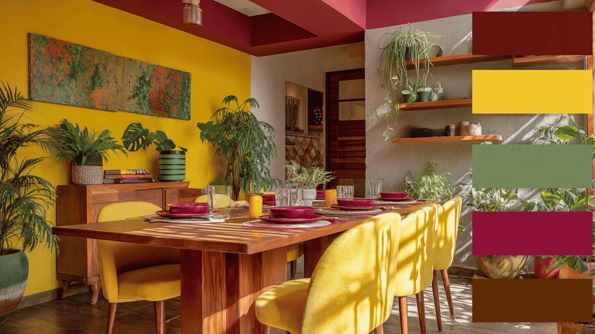
This color scheme balances the richness of burgundy with the brightness of mustard-yellow and the freshness of sage-green.
It’s great for spaces that need personality and life, like dining or art rooms. Burgundy adds depth, mustard-yellow lifts the mood, and sage-green grounds the look.
Together, these hues create an inspiring and lively environment with just the right mix of style and cheer.
4. Burnt Orange + Green + Powder Blue
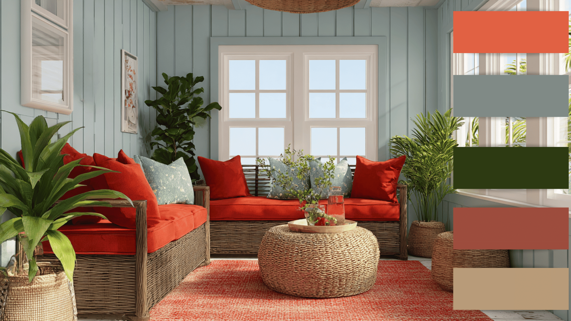
This trio pairs the warmth of burnt orange with the refreshing tones of green and powder-blue. It works beautifully for cozy yet balanced interiors.
Burnt-orange brings energy, green offers a natural vibe, and powder-blue cools the overall palette.
Try this mix in open-concept spaces where warmth and serenity coexist, like living rooms or sunrooms, creating a comfortable and inviting home environment.
5. Golden Yellow + Plum + Burgundy
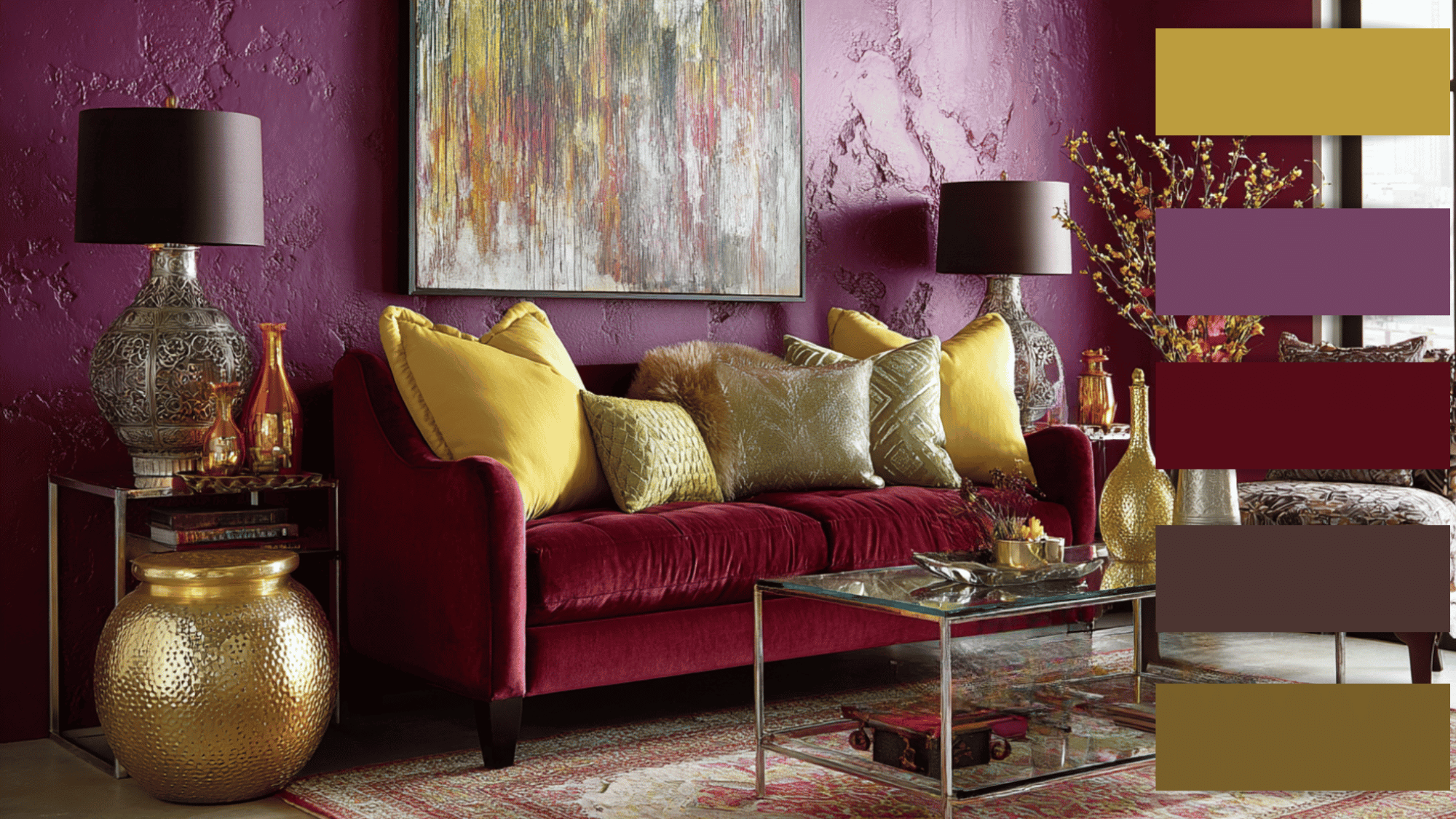
Here, the soft vibrancy of golden-yellow contrasts beautifully with the drama of plum and the passion of burgundy.
This color scheme is perfect for modern interiors that aim for bold character.
Pulm can dominate accent walls, burgundy can appear in decor pieces, and golden-yellow can add freshness through plants or upholstery. The result is a rich yet grounded beauty.
6. Royal Blue + Tangerine + Creamy White
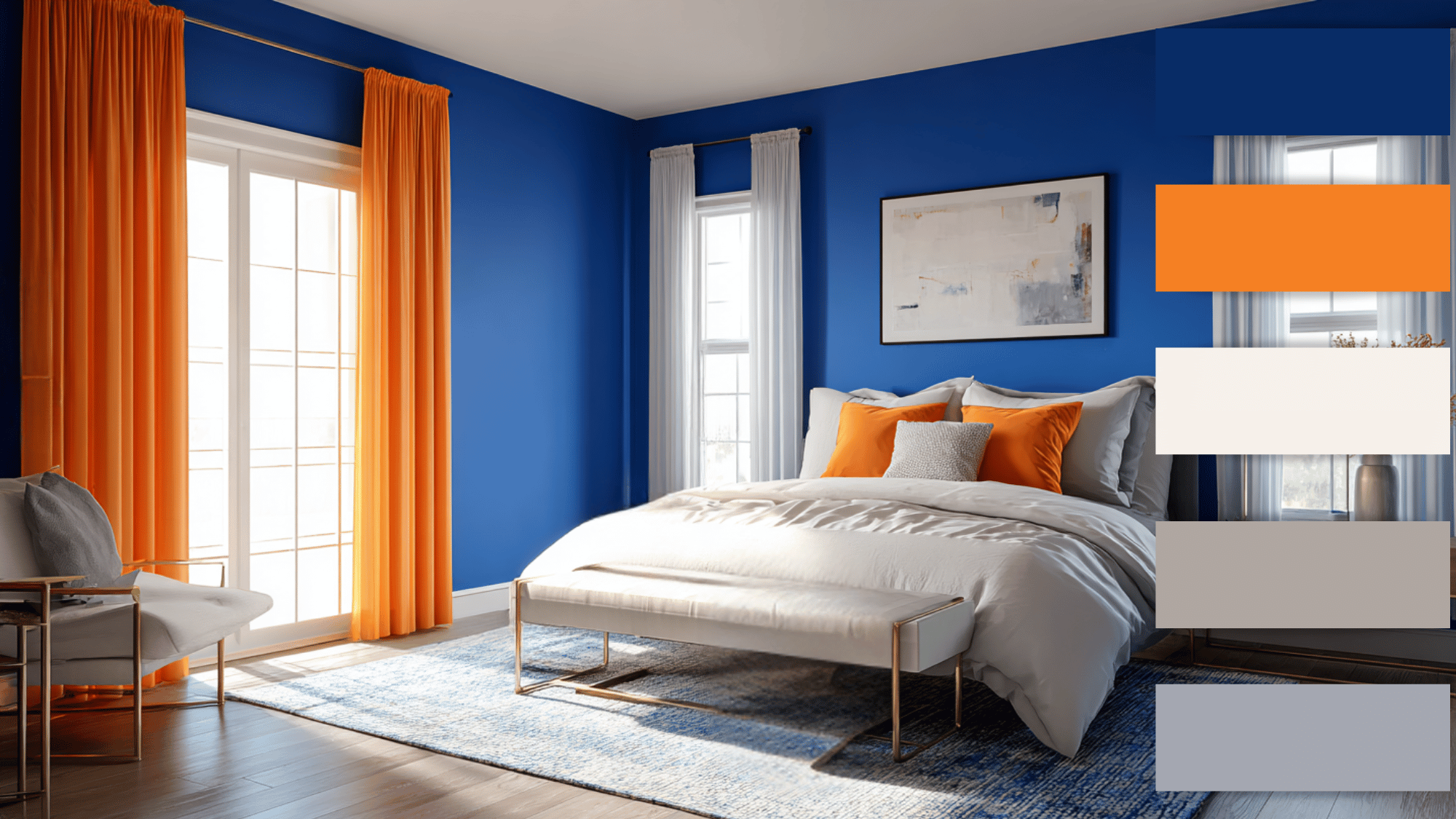
This combination merges the brightness of tangerine with the calming depth of royal blue and the mystery of creamy white. It’s ideal for bedrooms or creative studios.
Royal blue provides a peaceful base, while tangerine adds cheerfulness, and it improves style.
When used thoughtfully, this palette balances warm and cool tones, giving spaces both energy and modernity.
7. Aqua Blue + Coral Pink + Sand
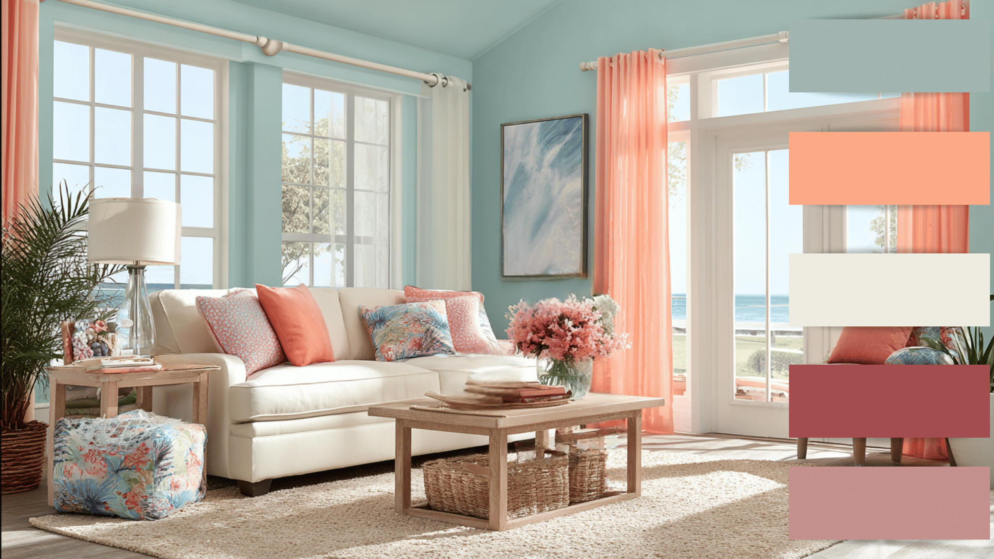
This scheme pairs cheerful sand with luxurious coral pink and soothing aqua blue.
It’s perfect for interiors seeking both warmth and refinement. Sand brings positivity, aqua blue calms the space, and coral pink adds richness.
Ideal for living or study areas, this palette encourages creativity and comfort while maintaining visual harmony.
8. Forent Green + Plum + Burnt Orange
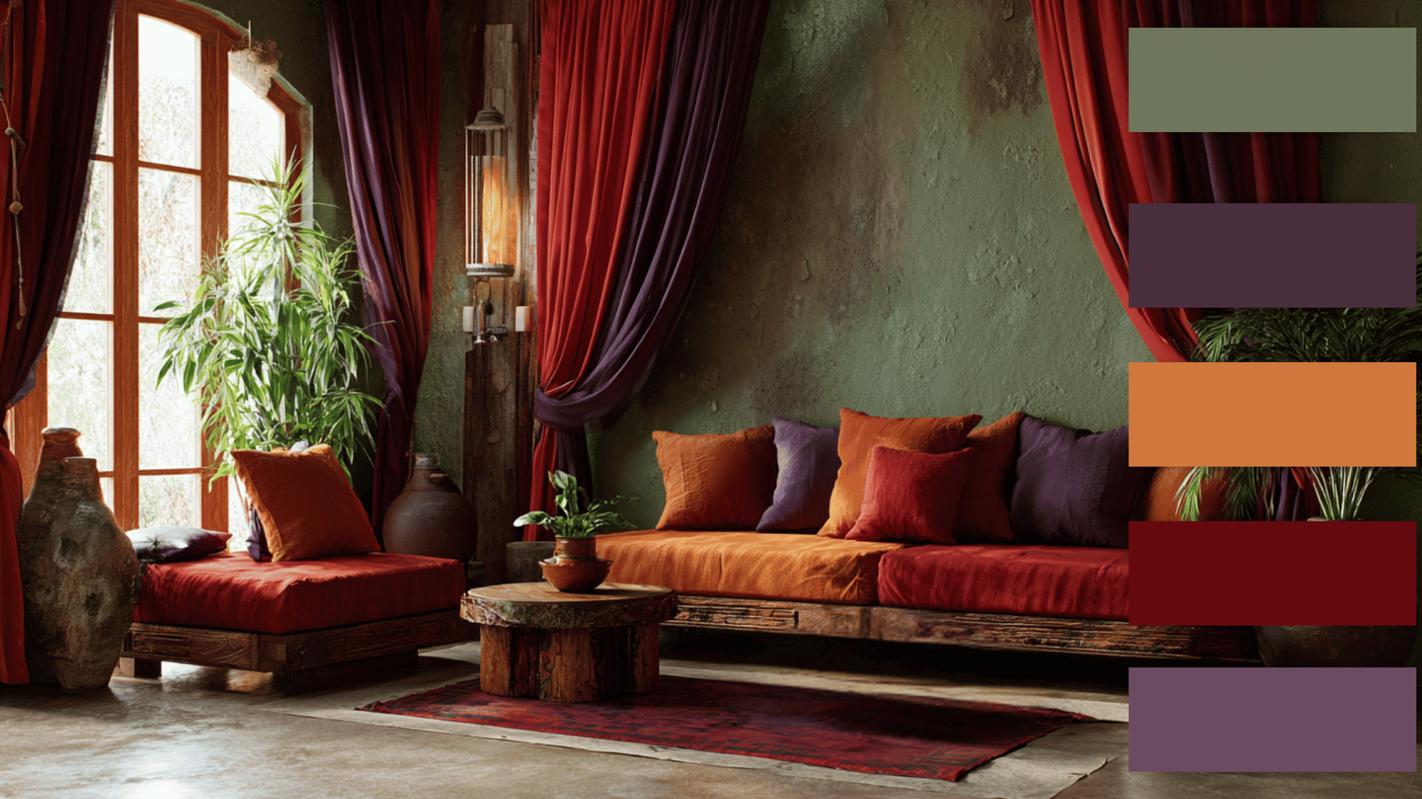
Combining earthy green with the passion of burnt-orange and the style of pulm results in a warm yet balanced palette.
Forent-green grounds the design, while the red tones add excitement and depth.
This mix works beautifully in rustic or bohemian spaces, especially when used in textiles, wall art, or accent furniture. It evokes both nature and warmth effortlessly.
9. Cobalt Blue + Coral + Mustard
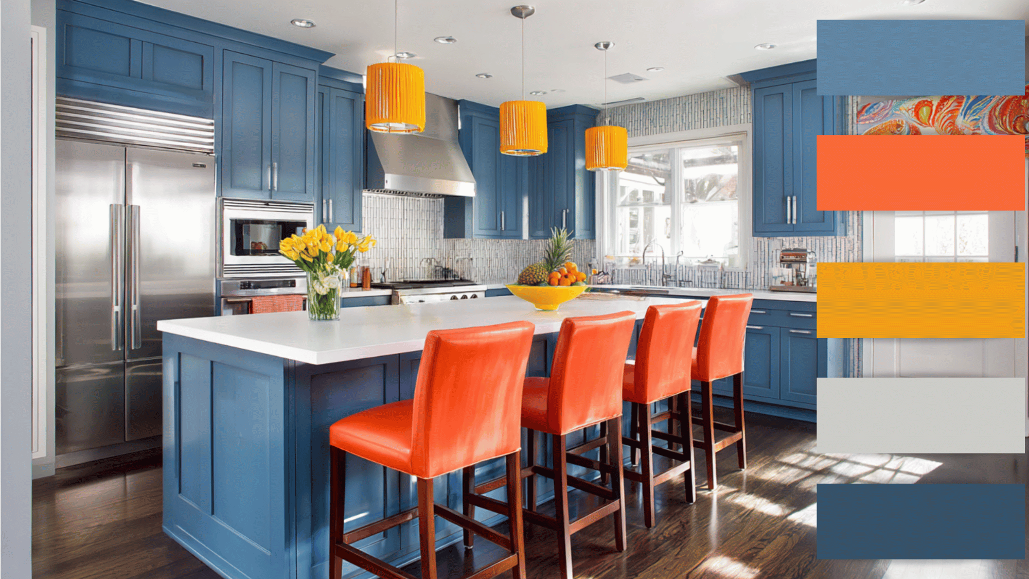
This palette contrasts cobalt blue with two warm hues, coral and mustard.
The result is a lively, energetic combination that’s great for social areas like kitchens or living rooms.
Cobalt blue serves as a calm backdrop, while the coral tones inject personality and warmth. It’s a classic, inviting mix that never feels dull.
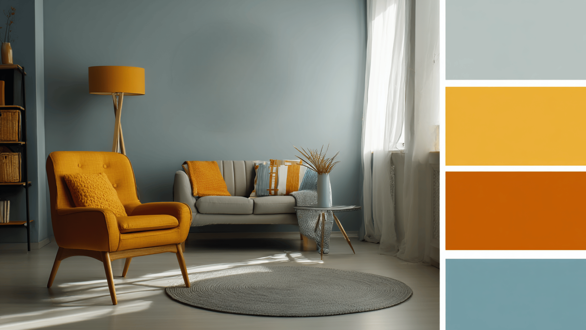
10. Gray Blue + Burnt Orange + Terracotta
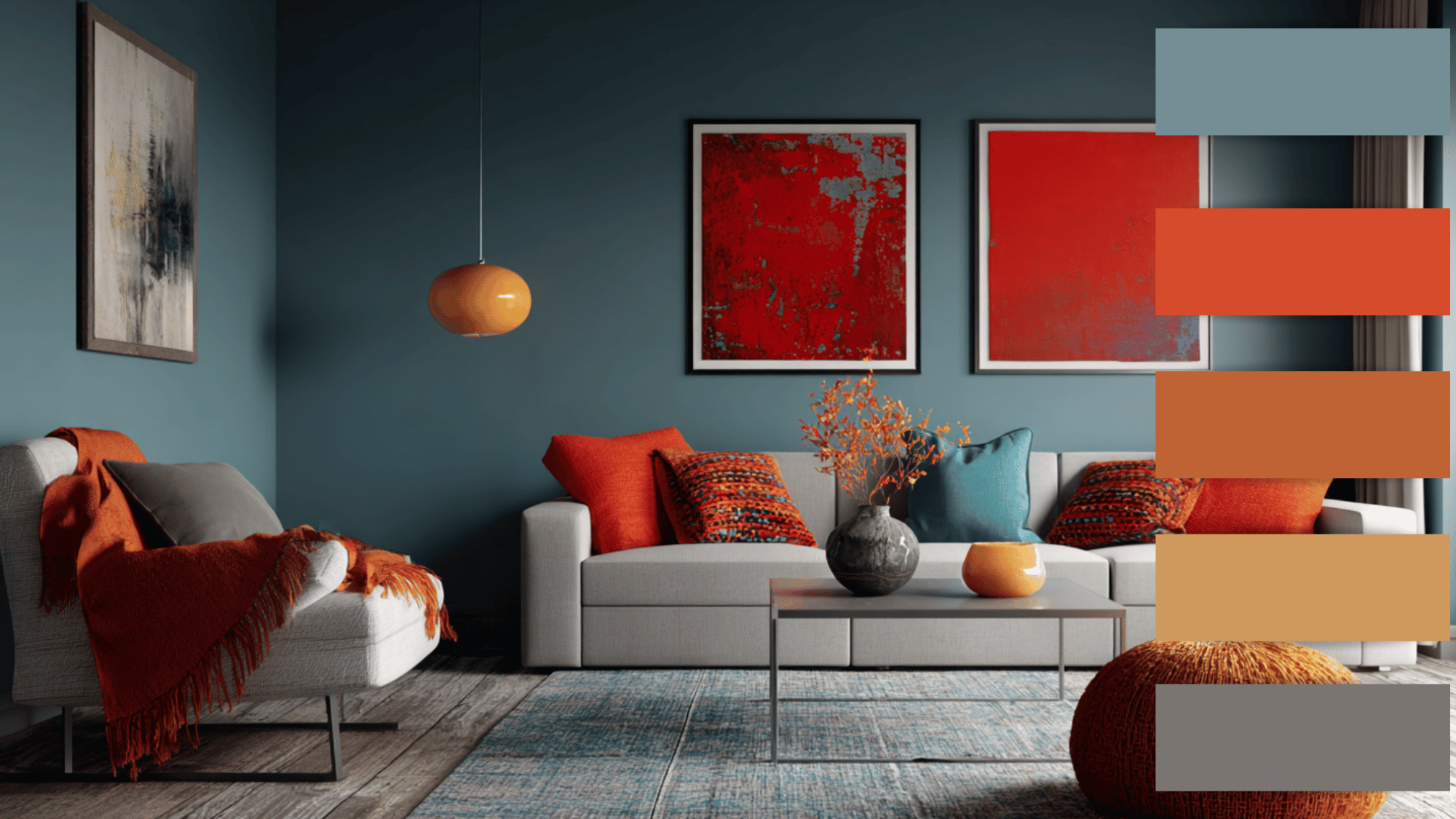
This scheme balances the intensity of terracotta and burnt-orange with the cool tranquility of gray-blue.
Ideal for vibrant yet sophisticated interiors, it offers both energy and relaxation.
Use gray-blue for walls, terracotta for smaller accents, and burnt-orange for decor elements to achieve a playful but coordinated design that feels dynamic and fresh.
11. Royal Blue + Orange + Golden Yellow
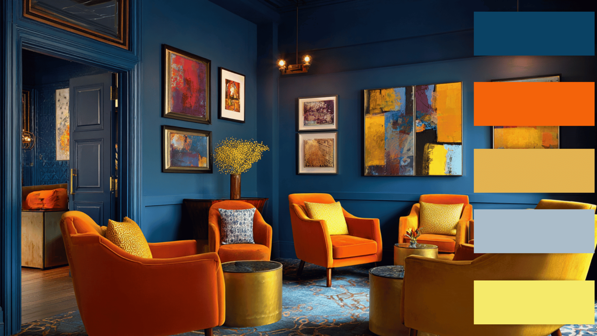
Royal blue depth, orange’s warmth, and golden yellow’s brightness make this trio striking yet balanced.
It’s a fantastic choice for artistic or creative spaces. Golden yellow highlights corners, orange adds energy, and royal blue ties everything together.
This palette creates a confident, lively interior that’s full of contrast without being overwhelming.
12. Lavender + Mint Green + Golden Yellow
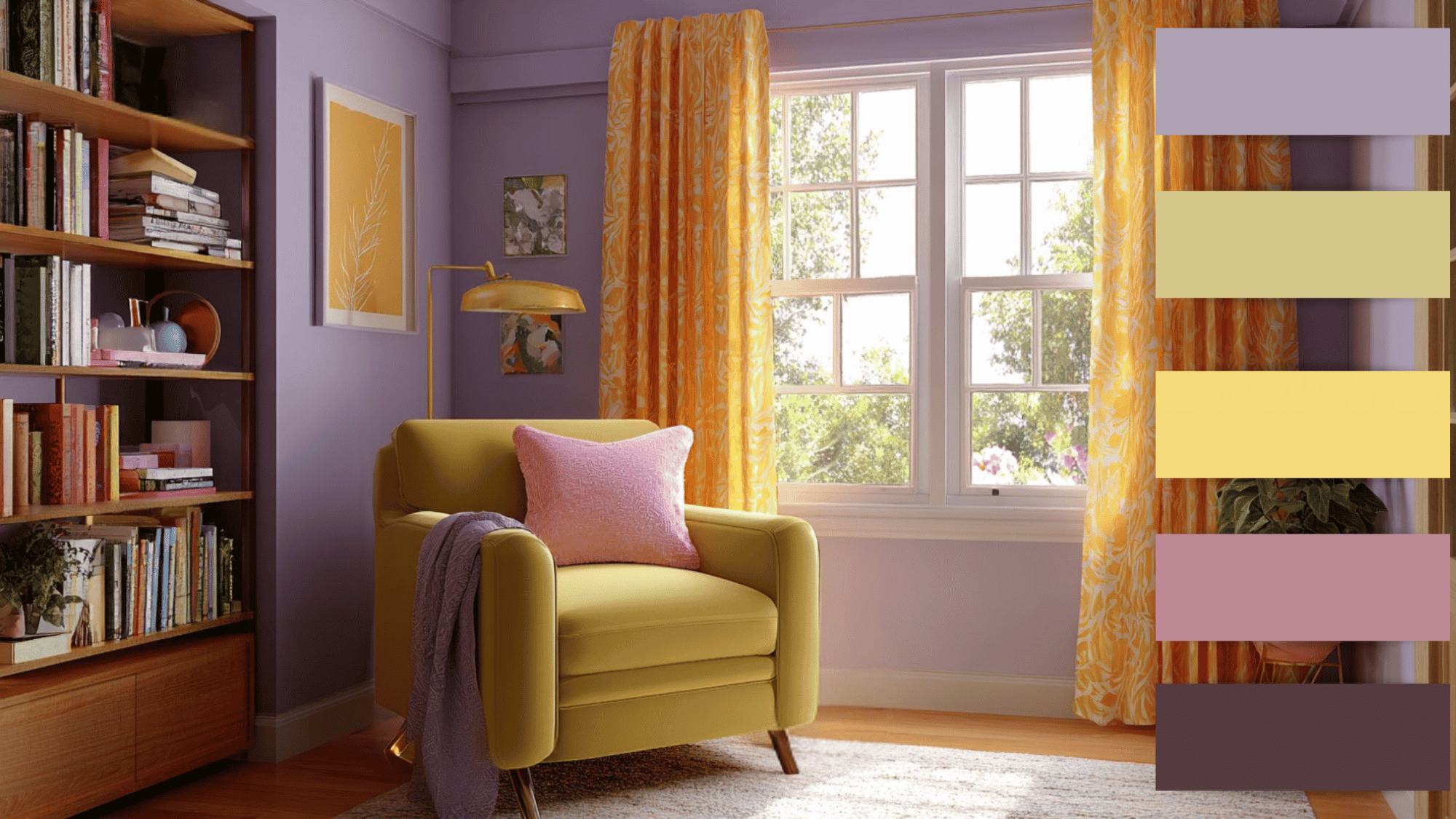
This scheme offers a perfect mix of calm and cheer. Lavender adds luxury, mint-green provides freshness, and golden-yellow brings warmth.
Ideal for bedrooms or reading nooks, this combination feels both soothing and joyful.
Each color complements the other beautifully, creating a space that feels uplifting yet serene, a true reflection of balanced design harmony.
Errors to Avoid When Using a Split Complementary Color Scheme
Even with its flexibility, a split complementary color scheme can go wrong if not balanced carefully. Avoid these common mistakes.
- Choosing overly bright shades: Using intense tones for all three colors can make a space feel chaotic instead of balanced and visually comfortable.
- Skipping color testing: Colors can look different under various lighting conditions, so always test samples before finalizing to avoid unwanted surprises.
- Neglecting texture and materials: Smooth and rough surfaces reflect light differently, which can alter how split complementary colors appear in a room.
- Using mismatched accents: Combining too many unrelated accent pieces can clash with the color scheme and disrupt overall harmony.
- Ignoring room purpose: Bright, contrasting palettes may overwhelm relaxing areas like bedrooms, but work well in energetic spaces such as kitchens or playrooms.
Conclusion
A split complementary color scheme offers a perfect balance of contrast, making it a favorite for designers and homeowners alike.
Understanding this color scheme helps create rooms that are both beautiful and balanced.
Whether used in home decor, art, or digital design, this approach brings depth, character, and visual comfort.
When chosen carefully and paired with good lighting and textures, a split complementary palette can completely transform a space into one that feels stylish, inviting, and classic.
