Have you ever felt confused about mixing different wood colors in your home? You’re not alone. Many people worry that their oak coffee table won’t match their walnut bookshelf.
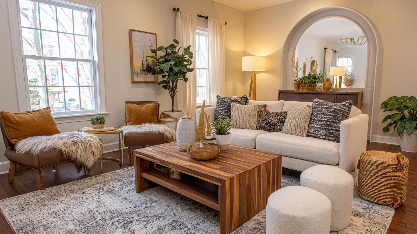
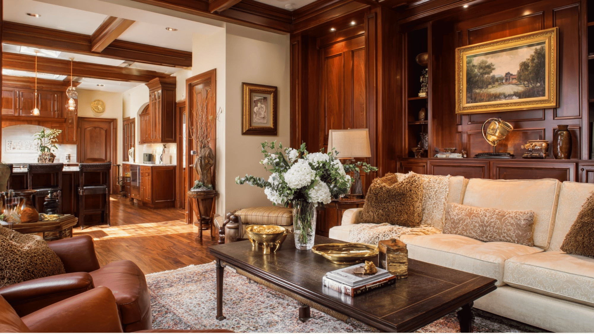
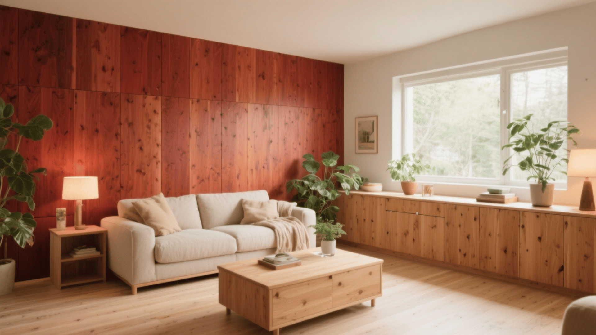
Wood tones that go together create warmth, depth, and interest in any room. Gone are the days when everything had to match perfectly. Today’s homes look better with variety.
If you’re decorating your living room, bedroom, or kitchen, learning to pair woods confidently will amplify your space.
In this, we’ll show you simple rules for combining warm wood tones. You’ll get to know which woods work beautifully together and learn tricks to avoid common mistakes.
What are Wood Tones?
Wood tones refer to the natural hues and undertones found in different types of wood. These tones are influenced by the wood species, grain pattern, and finish.
They generally fall into three categories:
- Warm
- Cool
- Neutral
Warm wood tones have red, orange, or yellow undertones that bring coziness and richness to a space.
Cool tones carry subtle blue or gray hues that create a calm, modern feel. Neutral woods strike a balance between the two and pair easily with any palette.
Wood Tone Spectrum of Cool to Warm Shades
| Tone Category | Wood Type | Reference | Color Description |
|---|---|---|---|
Cool Woods |
Poplar |  |
Soft blonde with green-gray hues |
| Maple | 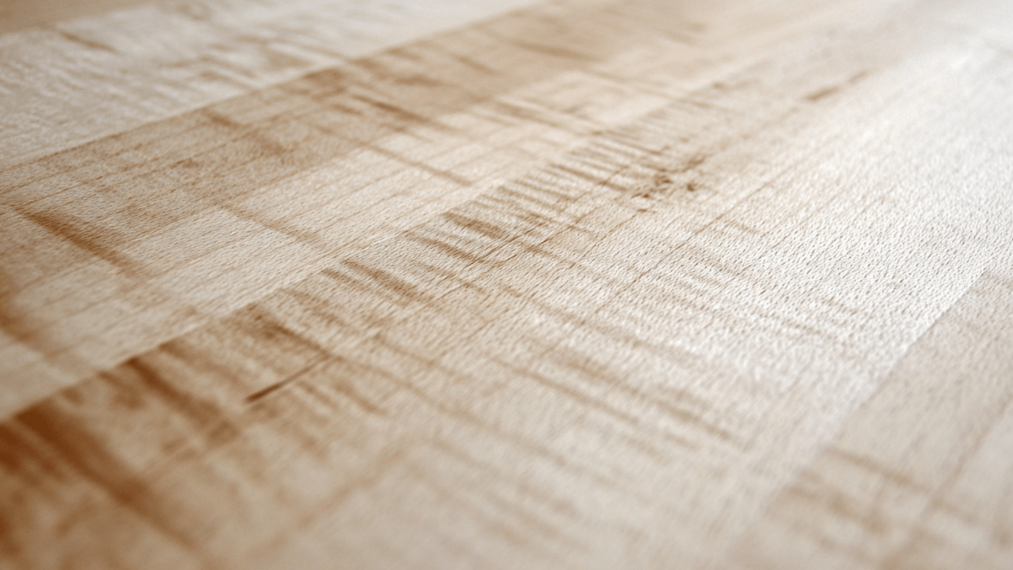 |
Light creamy tone with a slight gray cast | |
| Ash | 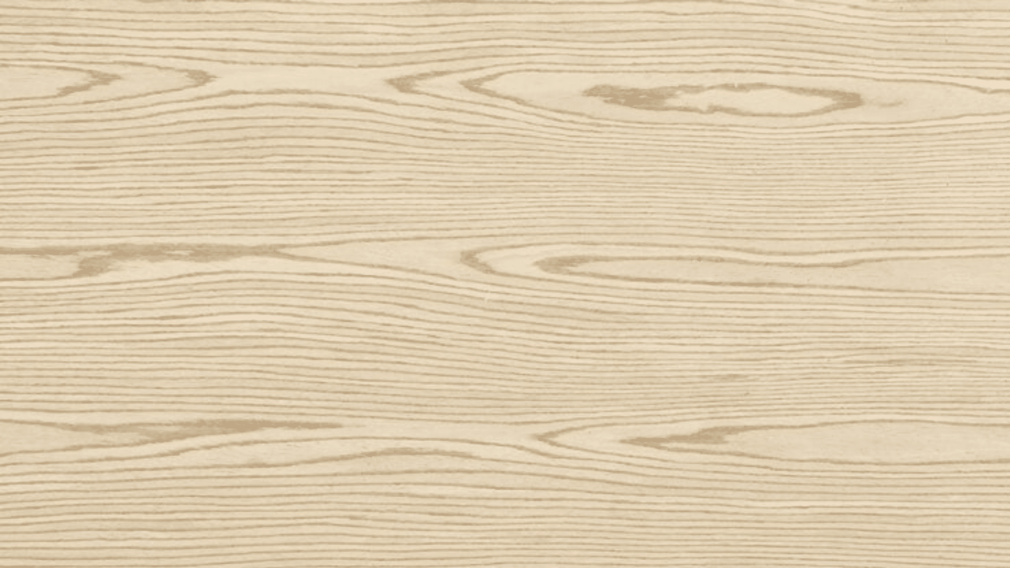 |
Pale beige with subtle gray undertones | |
| Neutral Woods | Oak (White Oak) | 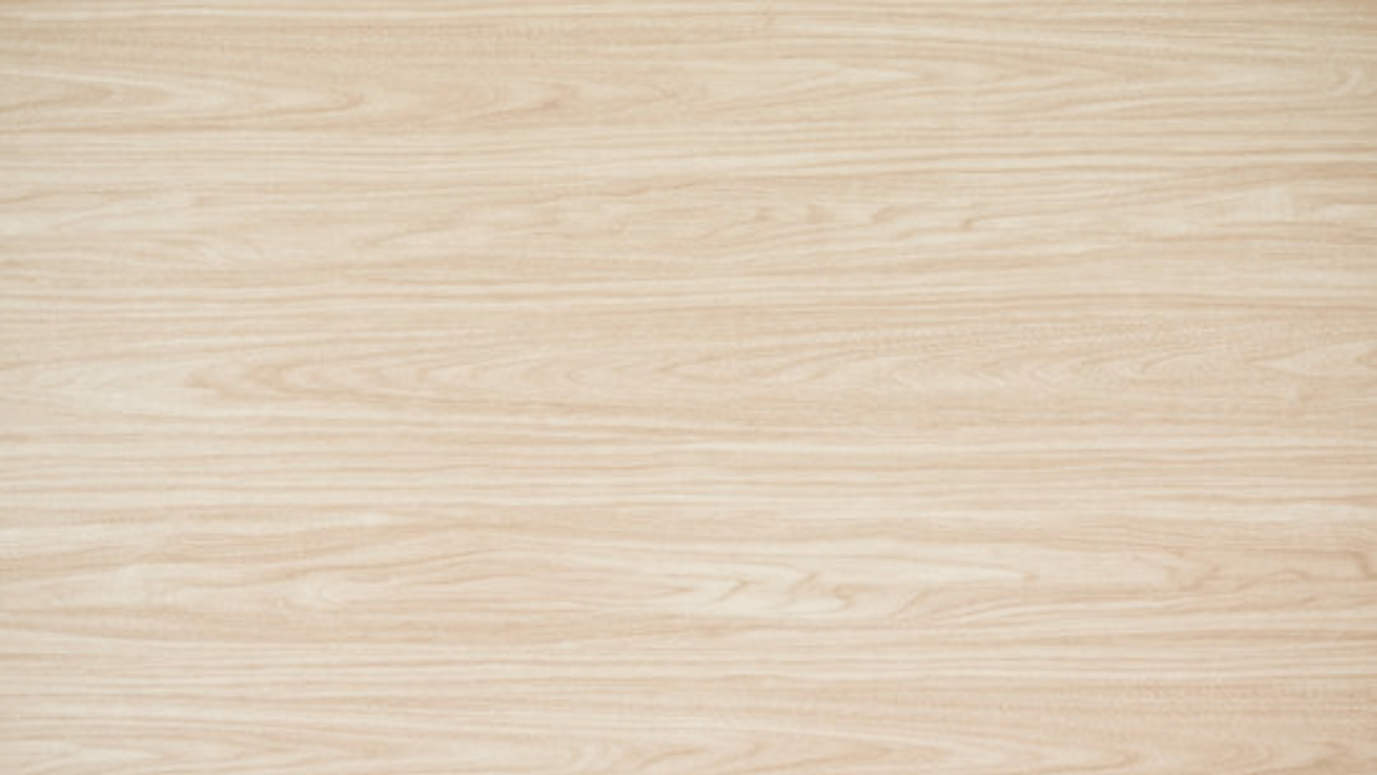 |
Balanced beige with a light golden tint |
| Birch | 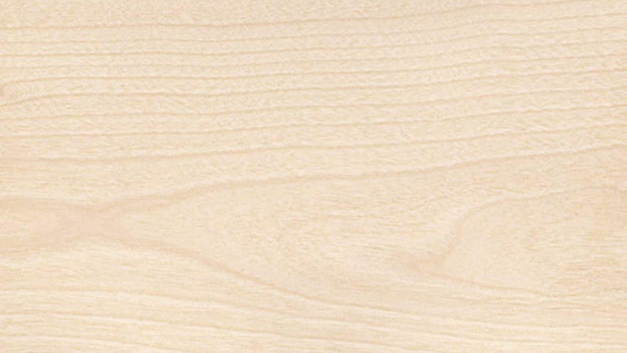 |
Pale cream to light tan | |
| Beech | 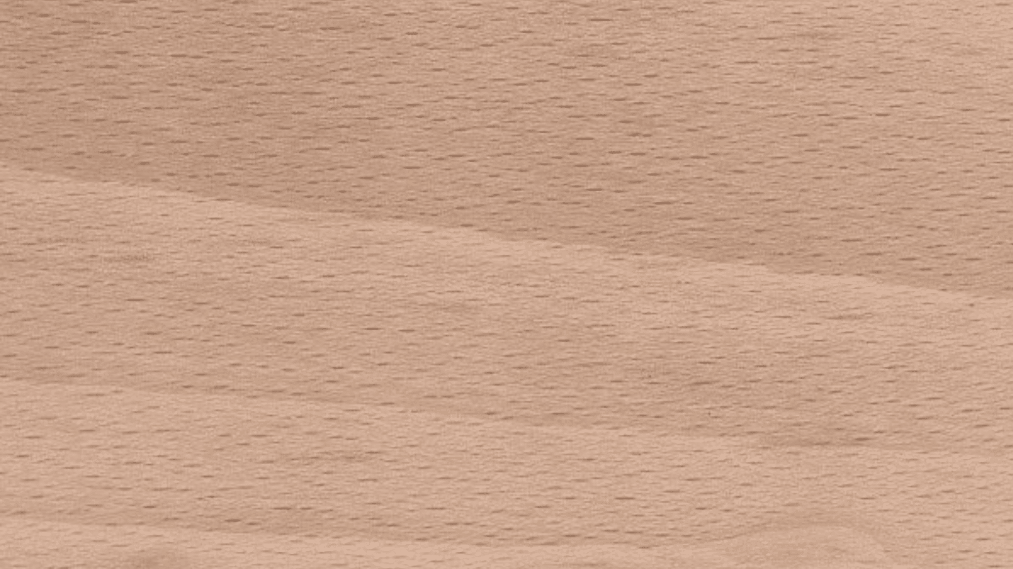 |
Warm-neutral tan with slight pink undertones | |
| Warm Woods | Cherry | 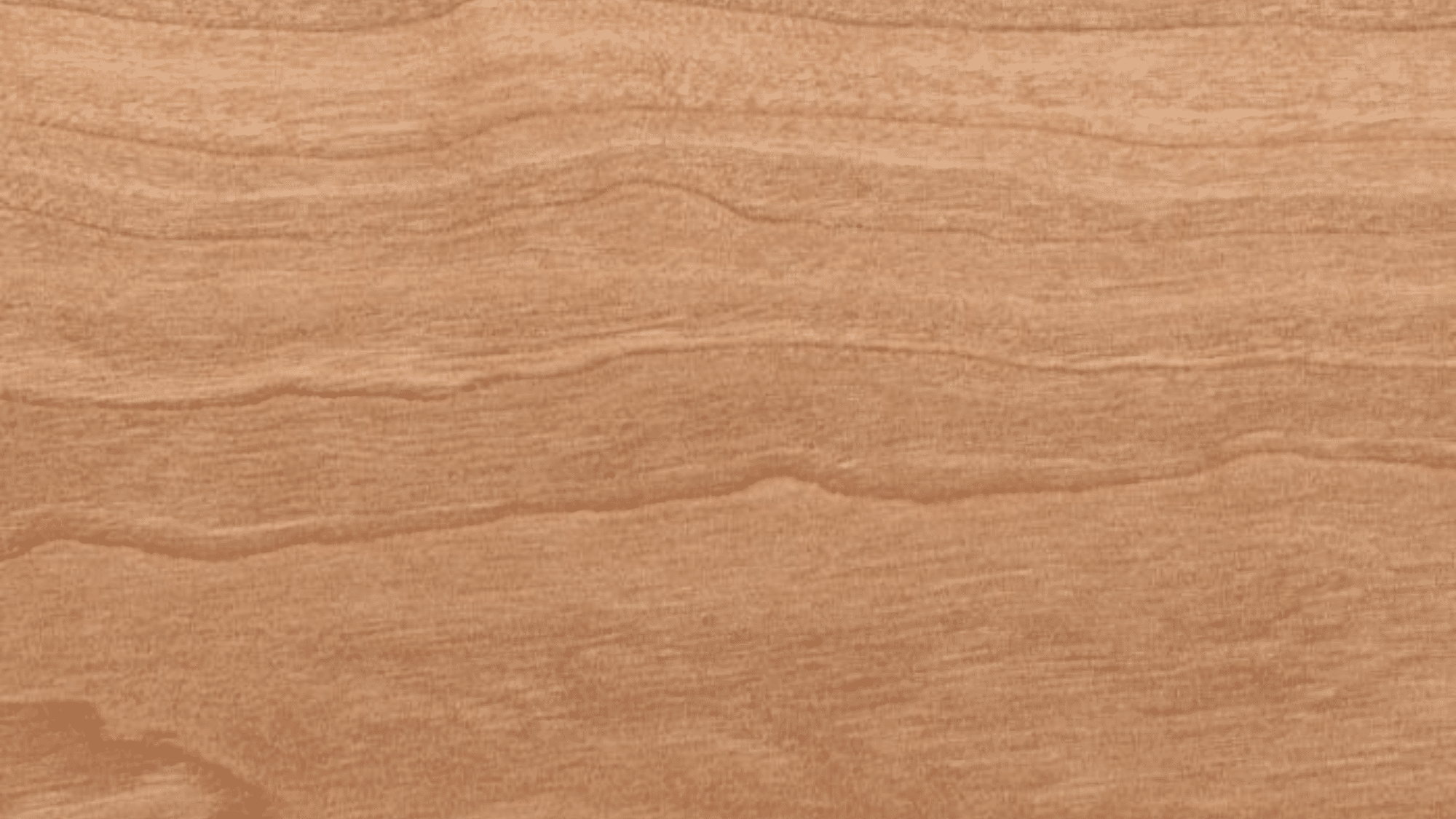 |
Reddish-brown that deepens over time |
| Teak | 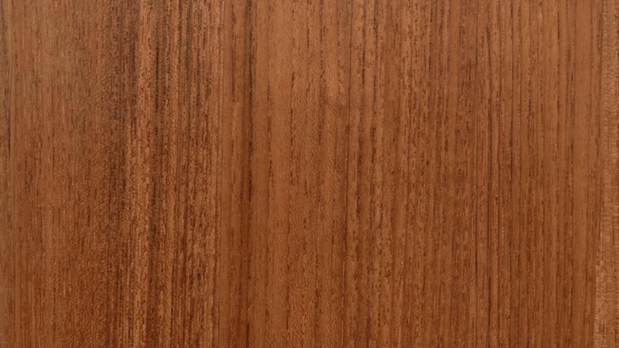 |
Golden-brown with natural oil sheen | |
| Walnut | 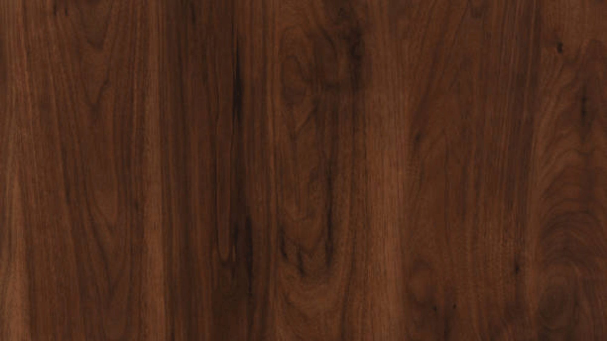 |
Rich chocolate brown with warm undertones | |
| Mahogany | 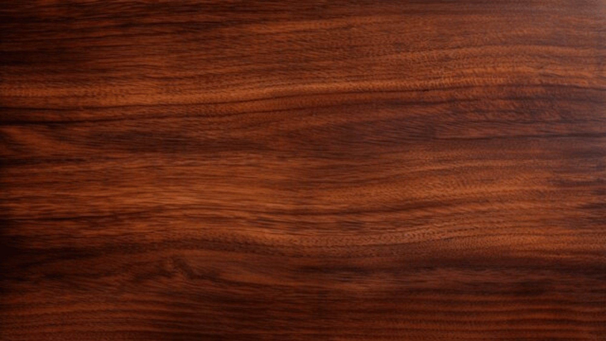 |
Deep red-brown with golden warmth | |
| Cedar | 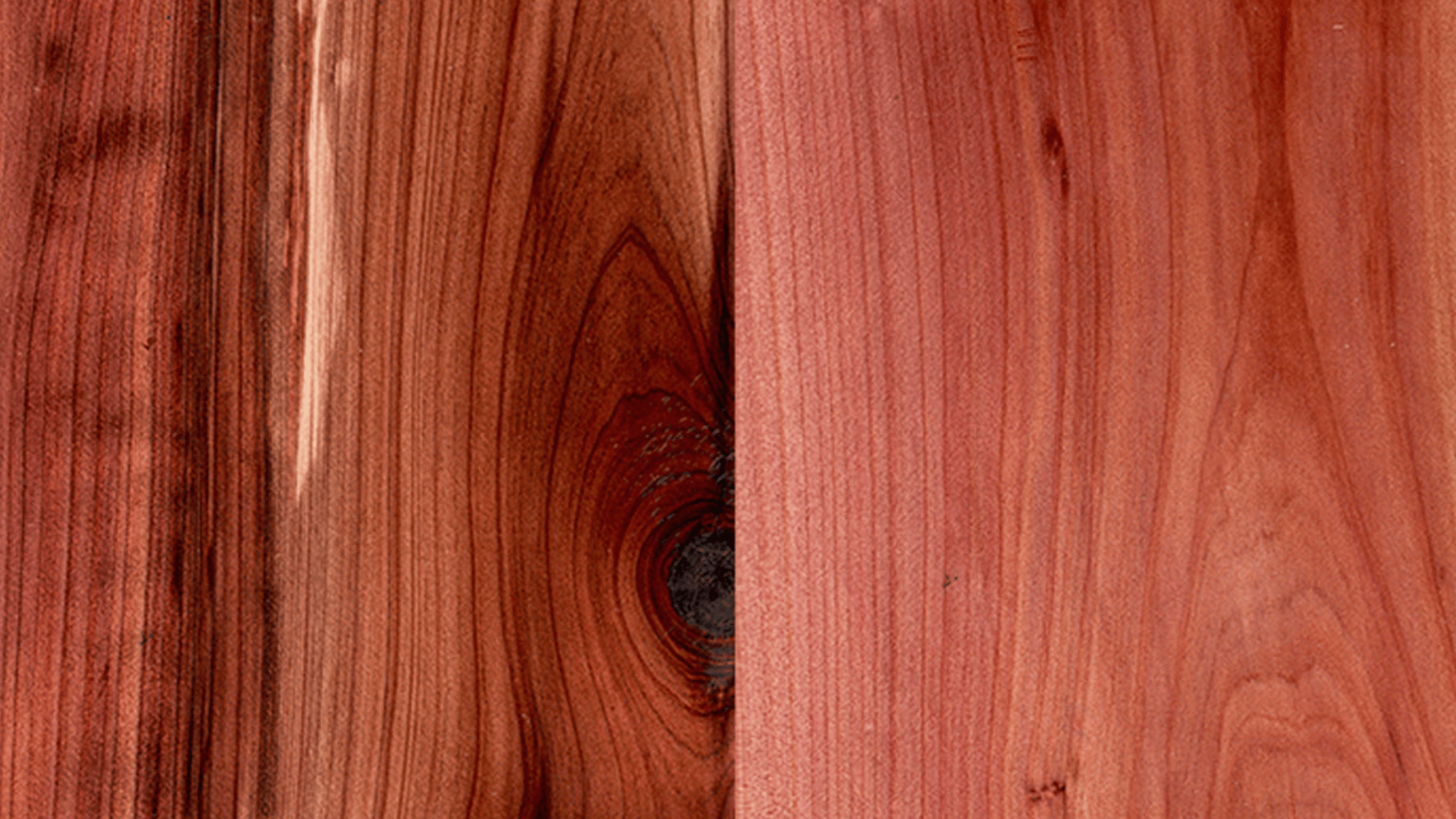 |
Reddish tone with aromatic quality |
How to Mix Warm Wood Tones Effectively?
Blending warm wood tones is all about creating harmony through balance and contrast. When done thoughtfully, it gives a space character and depth while maintaining a cohesive flow.
- Choose a Dominant Wood Tone: Start with one main wood tone, like flooring or cabinets, to anchor your space and guide other wood choices for a cohesive, intentional design.
- Match the Undertones: Keep undertones consistent across pieces. Warm woods with red or golden hues blend naturally, ensuring harmony instead of visual clashes between tones.
- Vary the Shades for Depth: Mix light, medium, and dark tones for contrast and richness. Balanced variation prevents monotony and enhances your space’s natural character.
- Keep the Finishes Consistent: Consistent finishes unify different woods. Matching sheen levels, matte, satin, or glossy, creates flow and avoids mismatched, unbalanced appearances.
- Repeat Tones Throughout the Space: Repetition builds rhythm. Using each tone multiple times makes your mix feel deliberate, cohesive, and naturally balanced within the space.
Warm Wood Tone Combinations that Always Work
Finding wood tones that blend seamlessly can transform a room’s atmosphere. These classic warm pairings strike the perfect balance between comfort, contrast, and style.
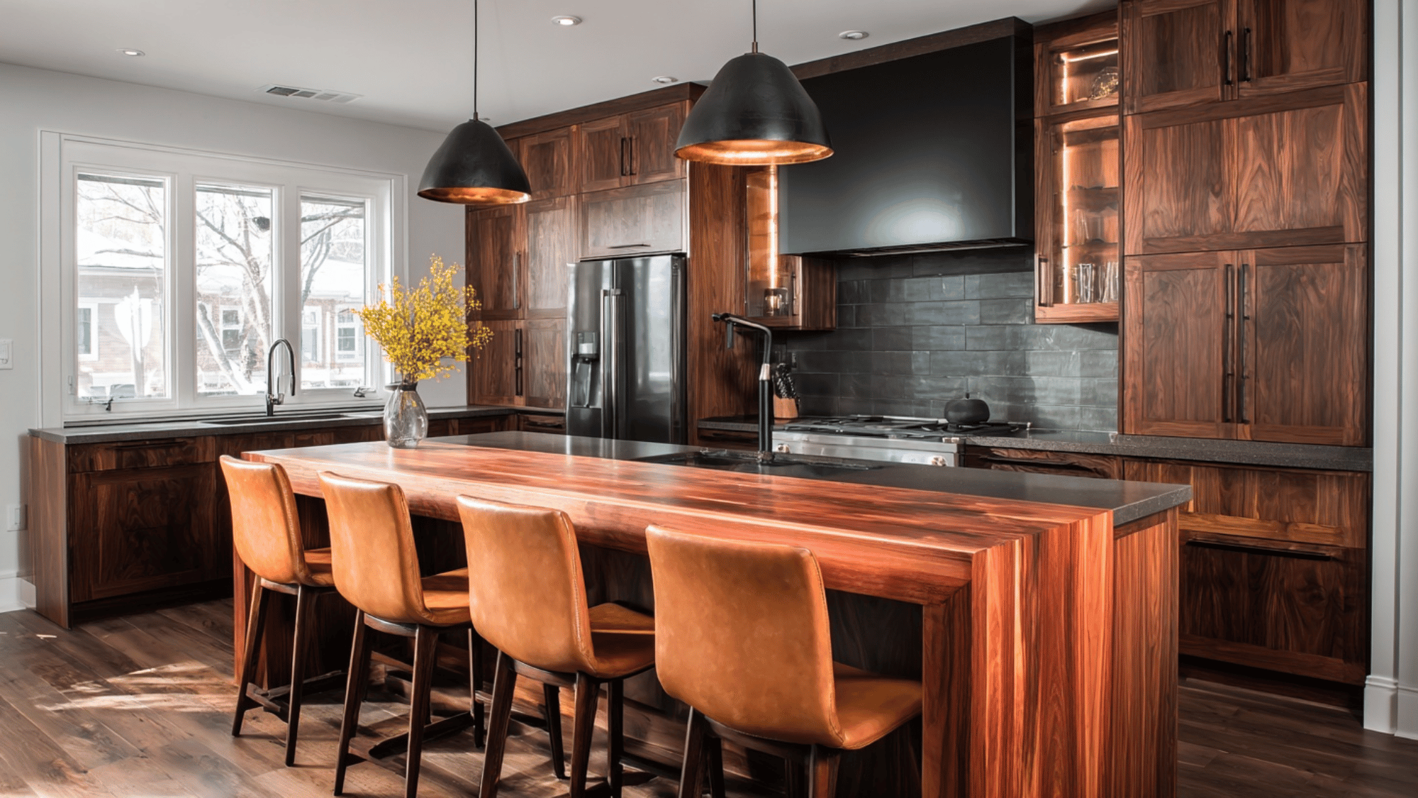
1. Cherry + Walnut
Cherry’s reddish warmth meets walnut’s deep brown richness, creating a charming look. The duo works beautifully in mid-century or classic interiors where contrast defines character.
- Accents: Brass, beige linen, and cream upholstery
- Complementary Colors: Soft taupe, ivory, and forest green
- Styling Tip: Keep finishes matte to prevent visual heaviness
2. Teak + White Oak
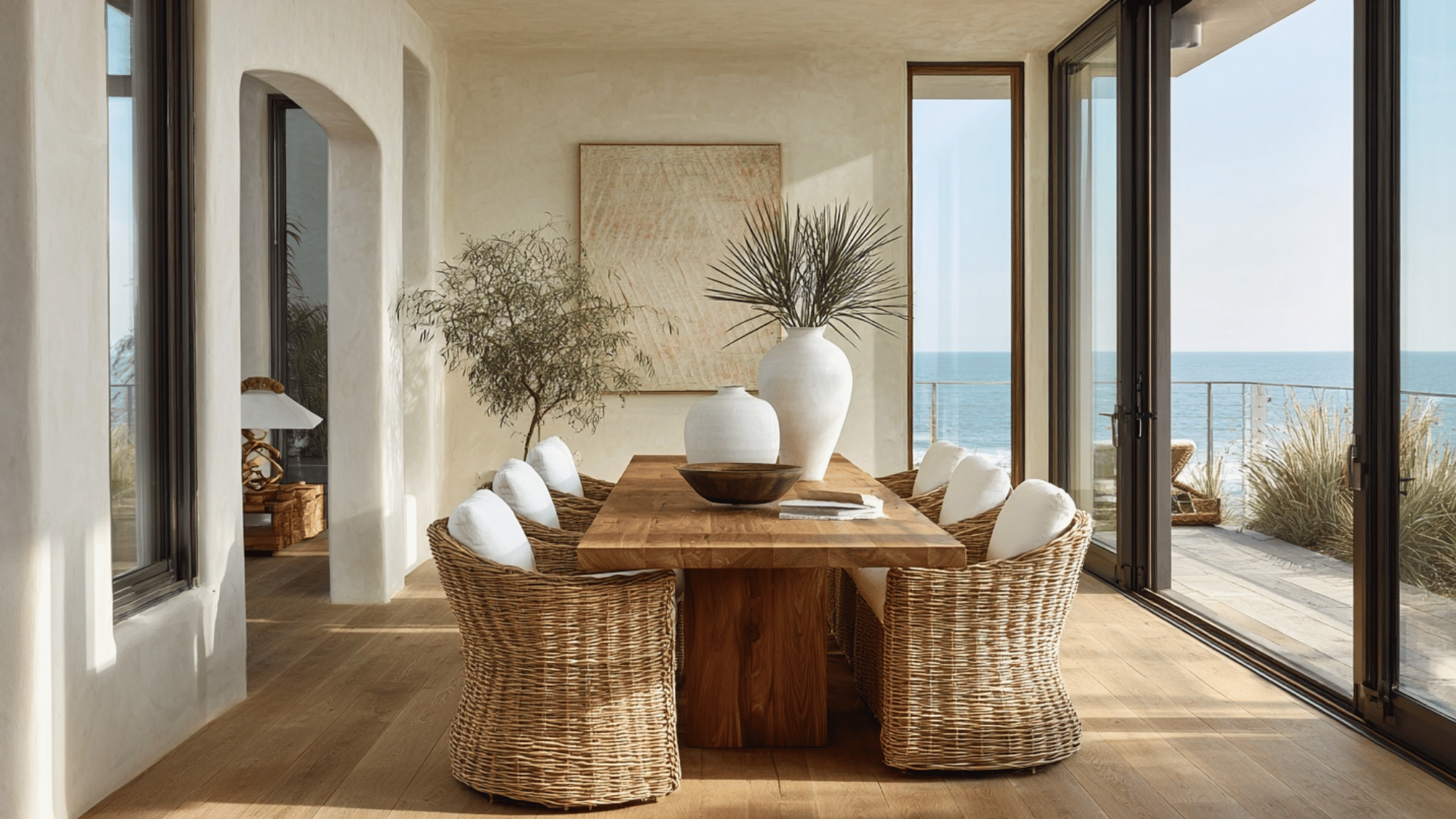
Teak’s golden undertones pair seamlessly with pale white oak for a bright, coastal-modern aesthetic. The mix adds warmth without overpowering natural light.
- Accents: Rattan, white ceramics, and brushed nickel
- Complementary Colors: Sky blue, sand, and crisp white
- Styling Tip: Use teak in small doses, like trim or furniture frames
3. Mahogany + Maple
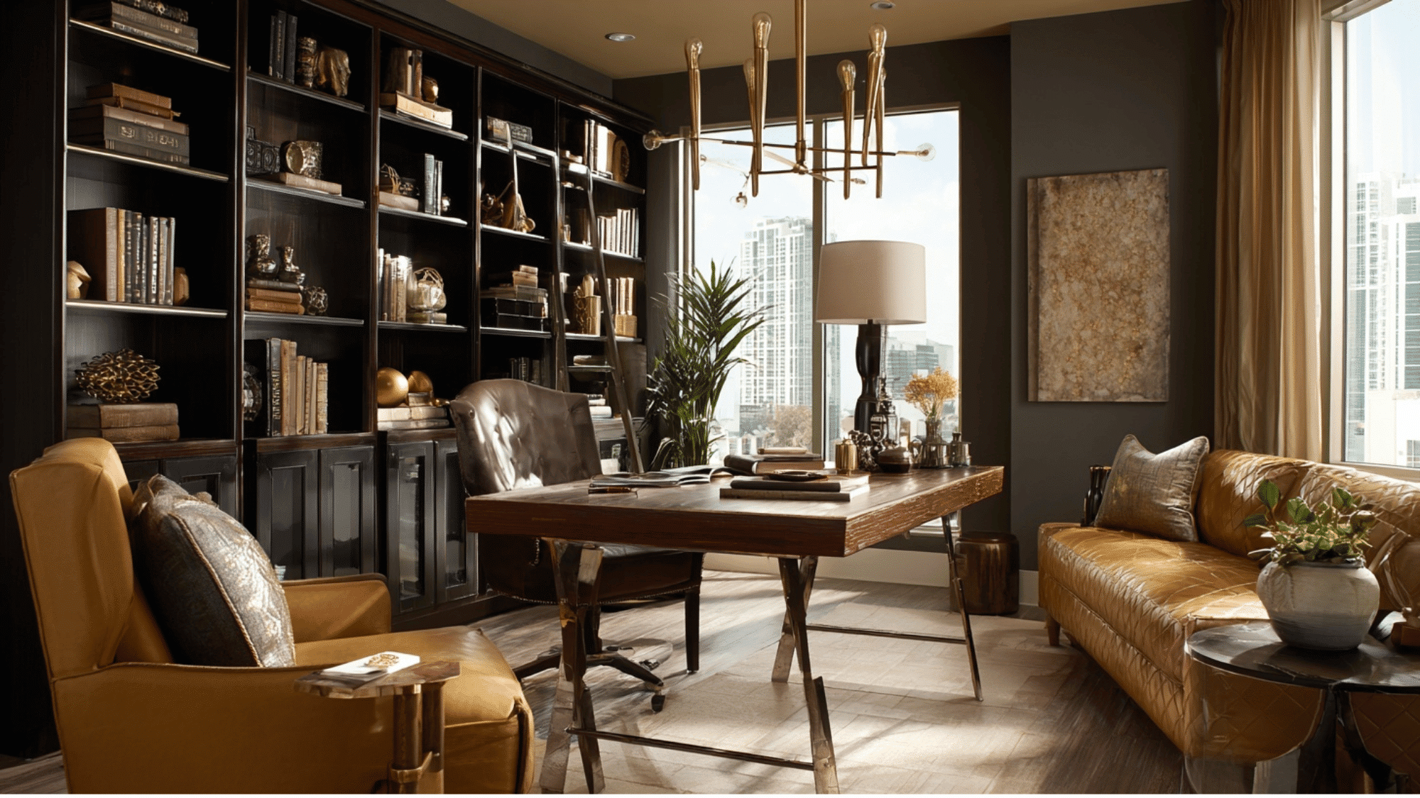
Mahogany’s deep red tone paired with maple’s creamy hue creates an interesting contrast while retaining warmth. Perfect for traditional yet airy spaces.
- Accents: Gold, warm beige textiles, and tan leather
- Complementary Colors: Olive green, coral, and soft brown
- Styling Tip: Let mahogany anchor lower elements and maple lighten upper areas
4. Cedar + Cherry
Cedar’s rustic orange-brown grain complements cherry’s refined red warmth for a cozy, organic combination ideal for cabins or earthy modern homes.
- Accents: Terracotta, woven jute, and dark bronze
- Complementary Colors: Burnt sienna, cream, and sage
- Styling Tip: Keep walls light to avoid an overly saturated palette
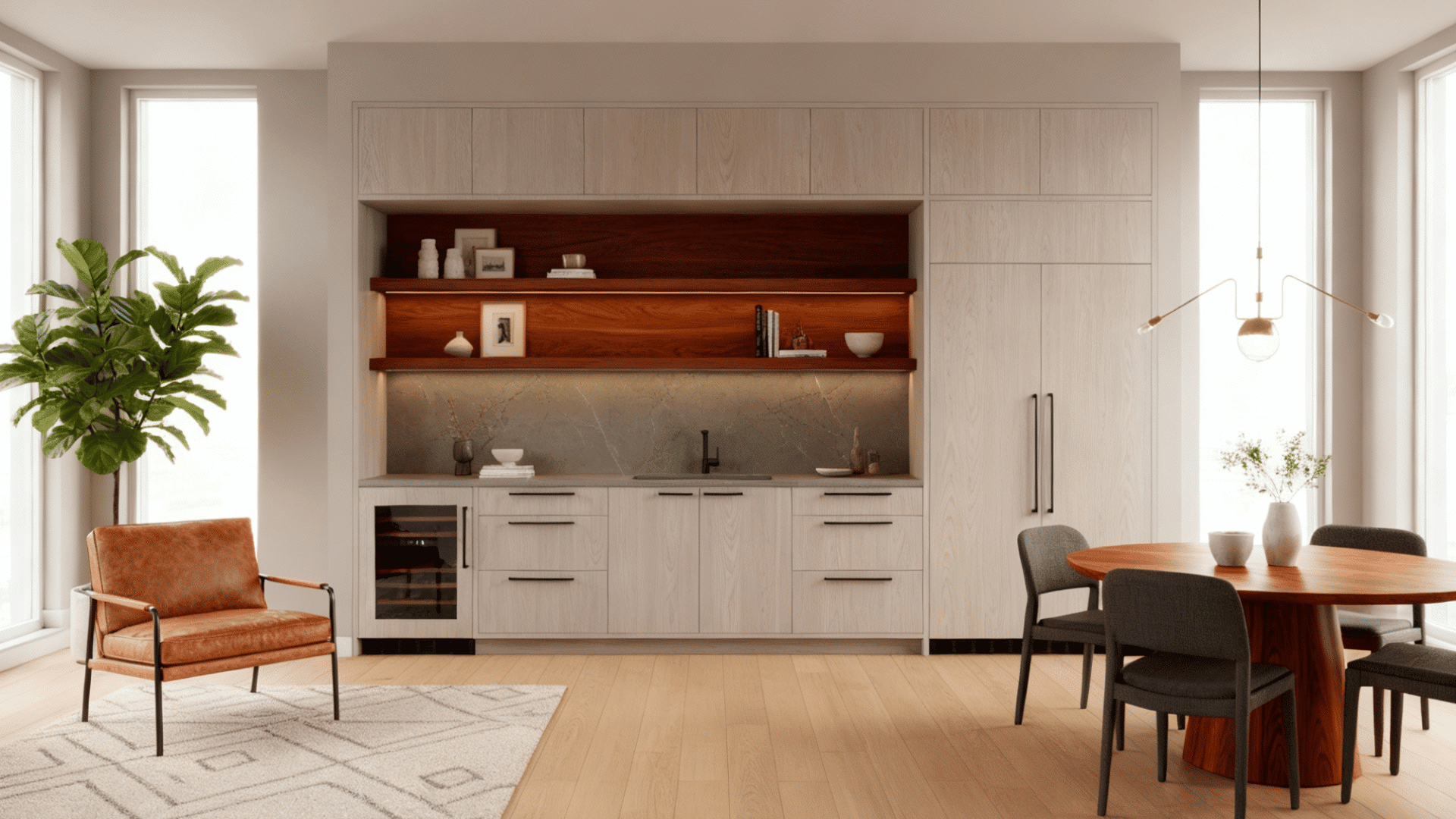
5. Walnut + Teak
Walnut’s chocolatey depth grounds the golden tones of teak, producing a modern yet inviting scheme often seen in Scandinavian and Japandi interiors.
- Accents: Black metal, linen, and stone
- Complementary Colors: Charcoal gray, off-white, and dusty green
- Styling Tip: Use consistent satin finishes for visual harmony
6. Mahogany + Ash
The pairing of mahogany and ash balances opulence with modern freshness. The light ash grain highlights mahogany’s luxurious depth, ideal for statement furniture.
- Accents: Chrome, wool, and glass
- Complementary Colors: Cream, navy, and muted burgundy
- Styling Tip: Use ash for flooring to brighten and ground the rich tones
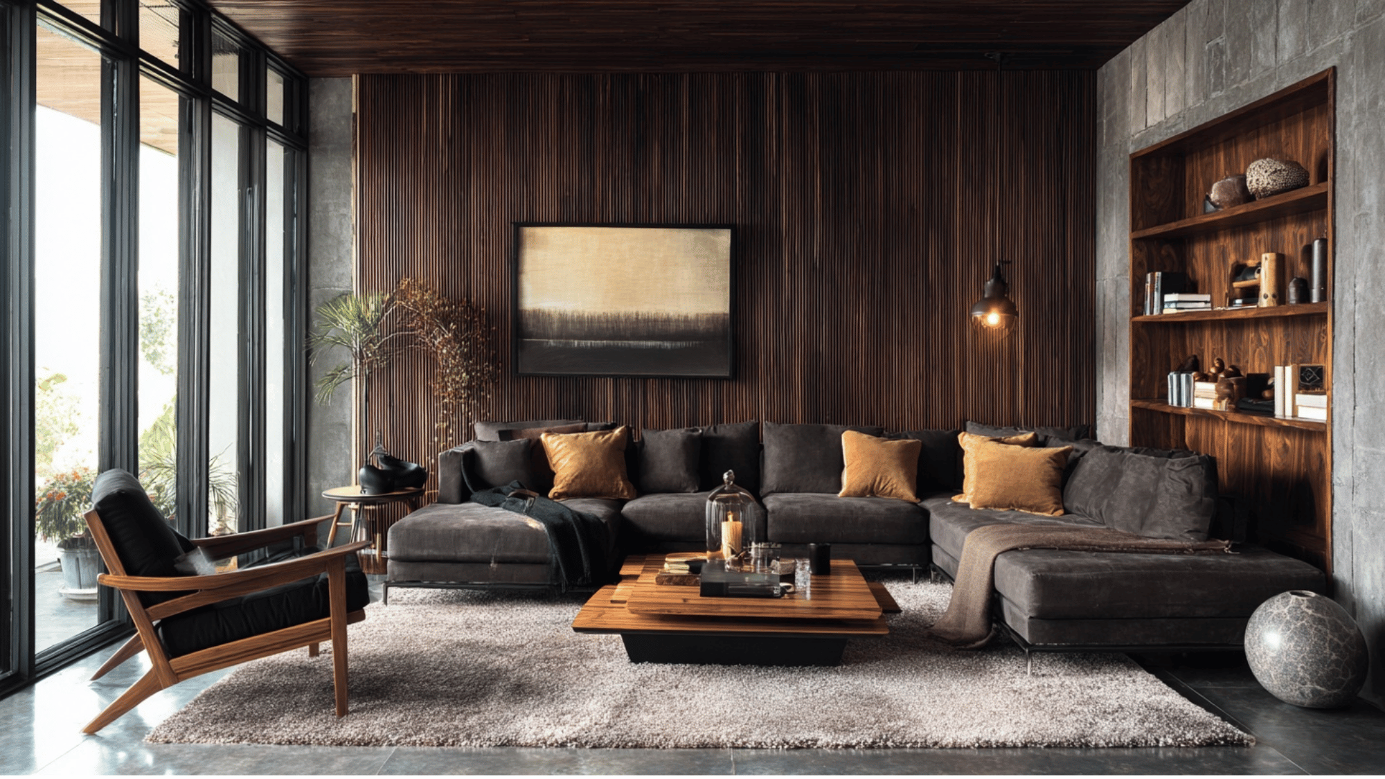
7. Cedar + Walnut
Cedar’s sunlit orange tone meets walnut’s bold darkness to create a striking natural contrast that feels contemporary yet grounded.
- Accents: Matte black, tan leather, and woven textiles
- Complementary Colors: Mustard, moss green, and soft white
- Styling Tip: Repeat walnut elements in small accents to tie the palette together
Common Mistakes to Avoid While Combining Wood Tones
Mixing wood tones can instantly elevate a space when done right, but a few common missteps can throw off the balance and make a room feel disjointed. Here’s what to watch out for:
- Using Too Many Wood Types: Too many wood tones can make a space look chaotic. Limit your palette to two or three that complement each other.
- Ignoring Undertones: Mixing warm and cool undertones creates visual clashes, so always match woods within the same undertone family.
- Forgetting About the Finish: Mismatched finishes disrupt harmony; keep the sheen level consistent or complementary across all wood pieces.
- Matching Everything Too Closely: Identical wood tones can look flat; mix light, medium, and dark shades that share a common undertone for depth.
- Neglecting Balance in the Space: Uneven distribution of tones can throw off visual flow. Spread wood shades evenly throughout the room.
- Forgetting Transitional Elements: Without bridges like rugs or metals, mixed woods can clash. Use neutral accents to tie tones together.
Conclusion
You now know the simple rules: vary your depths from light to dark, keep those warm undertones consistent, and balance your proportions throughout the room.
Start small if you feel nervous. Add one new wood piece at a time and see how it feels. Trust your eyes and your instincts.
There’s no single “right” way to mix woods. What matters most is creating a space that makes you happy and comfortable.
Your way to a beautifully layered, warm home starts today. Don’t let fear of mixing woods hold you back from finding that perfect piece you love!