Think 70s design is all about shag carpets and lava lamps? Think again.
The color palette from that groovy decade is making a serious comeback, and it’s bringing warmth, personality, and a refreshing break from the endless sea of gray minimalism we’ve been drowning in.
These aren’t your grandma’s colors; they’re being reimagined in ways that feel fresh, refined, and surprisingly modern.
Ready to add some vintage soul to your home? This blog shows how to bring these bold, beautiful hues into your space without turning it into a time capsule.
What Defines a ’70s Color Palette?
The 70s color palette is defined by its mix of earthy, muted tones and bold, expressive shades. It reflects the balance between nature-inspired calm and the energetic spirit of the era.
Popular colors like mustard yellow, avocado green, burnt orange, rust, and chocolate brown were everywhere, from home décor to fashion and art.
These hues created warmth and personality while celebrating individuality. Cultural influences played a big part in shaping this retro color palette.
The bohemian lifestyle introduced natural tones, disco culture added shimmer and contrast, and a growing love of nature inspired organic, grounded colors.
Together, they formed a palette that felt cozy, thrilling, and classic, a perfect reflection of the creative energy of the 1970s.
Pros and Cons of the 70s Color Palette
The 70s color palette offers nostalgic, beautiful warmth, but requires careful balance to avoid overwhelming modern interiors with too much retro intensity.
| Pros | Cons |
|---|---|
| Warm, inviting tones create a cozy and nostalgic atmosphere. | It can feel dated or overwhelming if overused. |
| Earthy hues pair well with natural materials and modern designs. | Some shades (like avocado green or mustard) may not suit all tastes. |
| Promotes individuality and creativity through bold color mixing. | Hard to balance without making the space look too busy. |
| Works beautifully in both vintage and contemporary interiors. | Finding the right modern accents to complement retro hues can be tricky. |
| Reflects eco-friendly and organic living trends. | May clash with minimalist or cool-toned things. |
70s Color Combinations for Home Décor
Bring the retro spirit to life with these vibrant and earthy 70s color combinations that add warmth, beauty, and classic style.
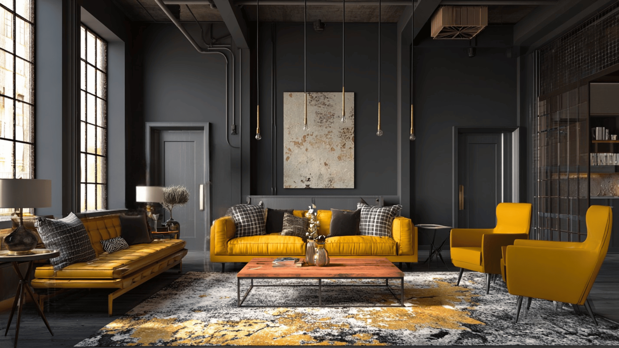
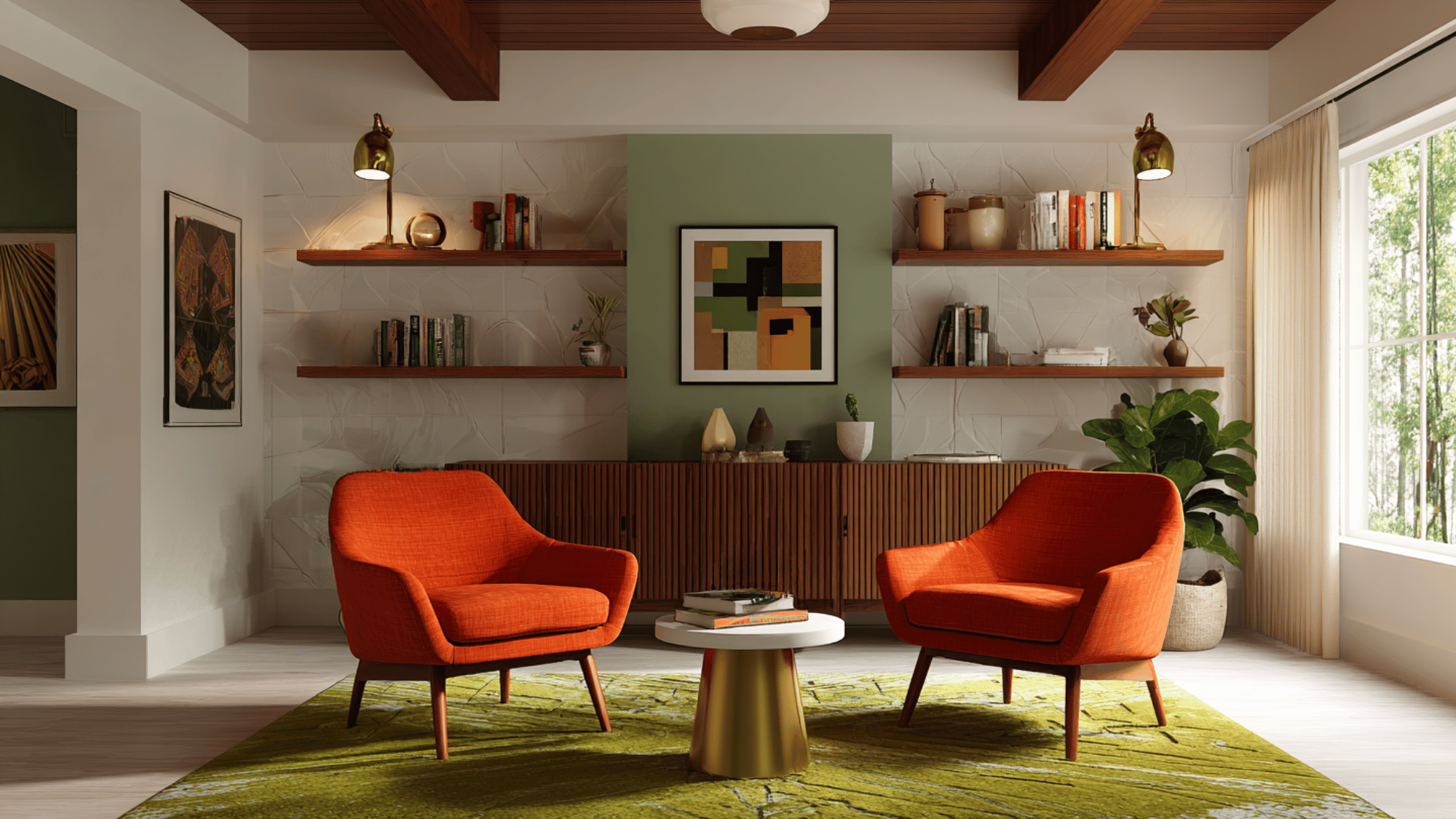
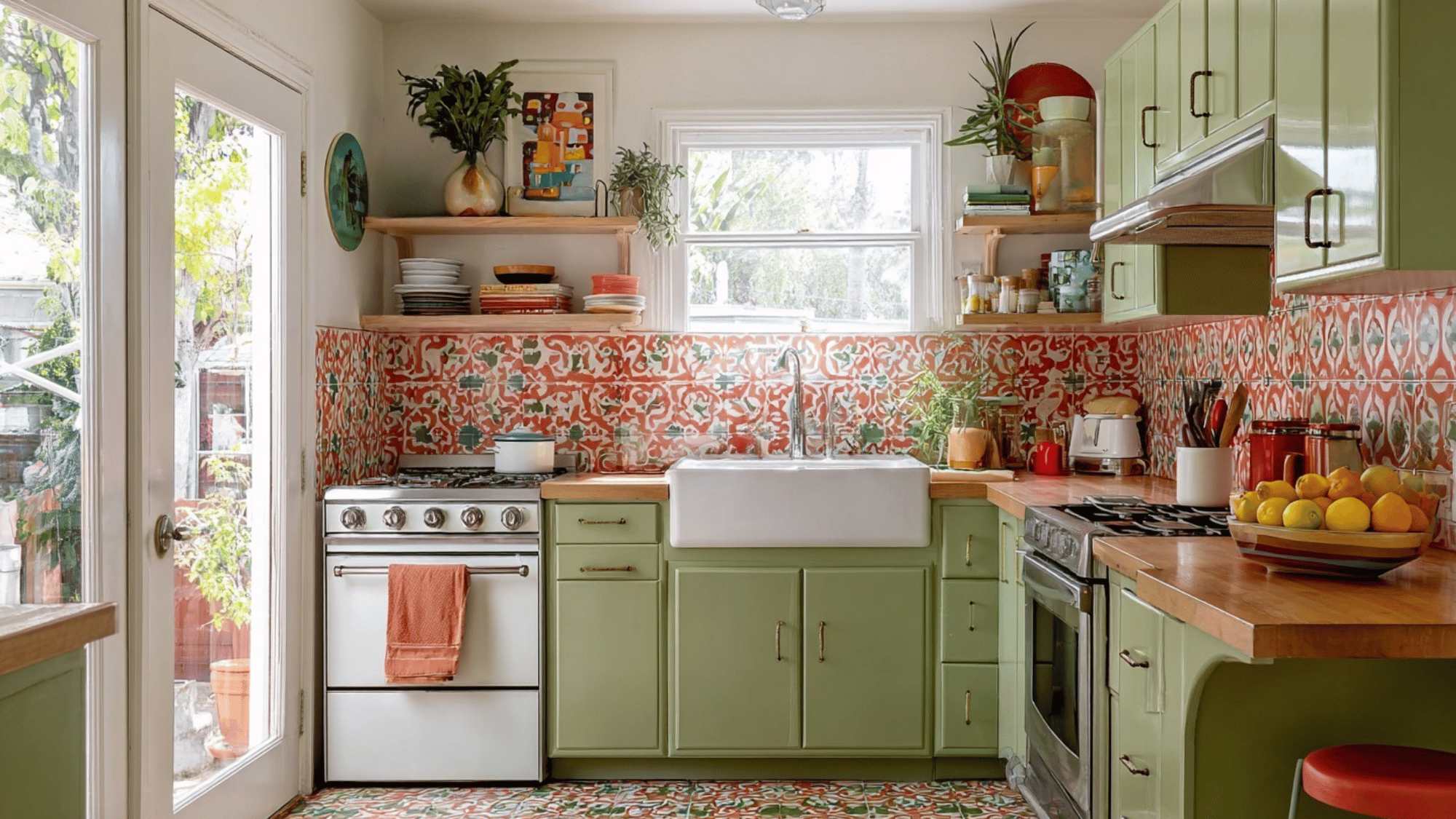
1. Mustard Yellow and Olive Green
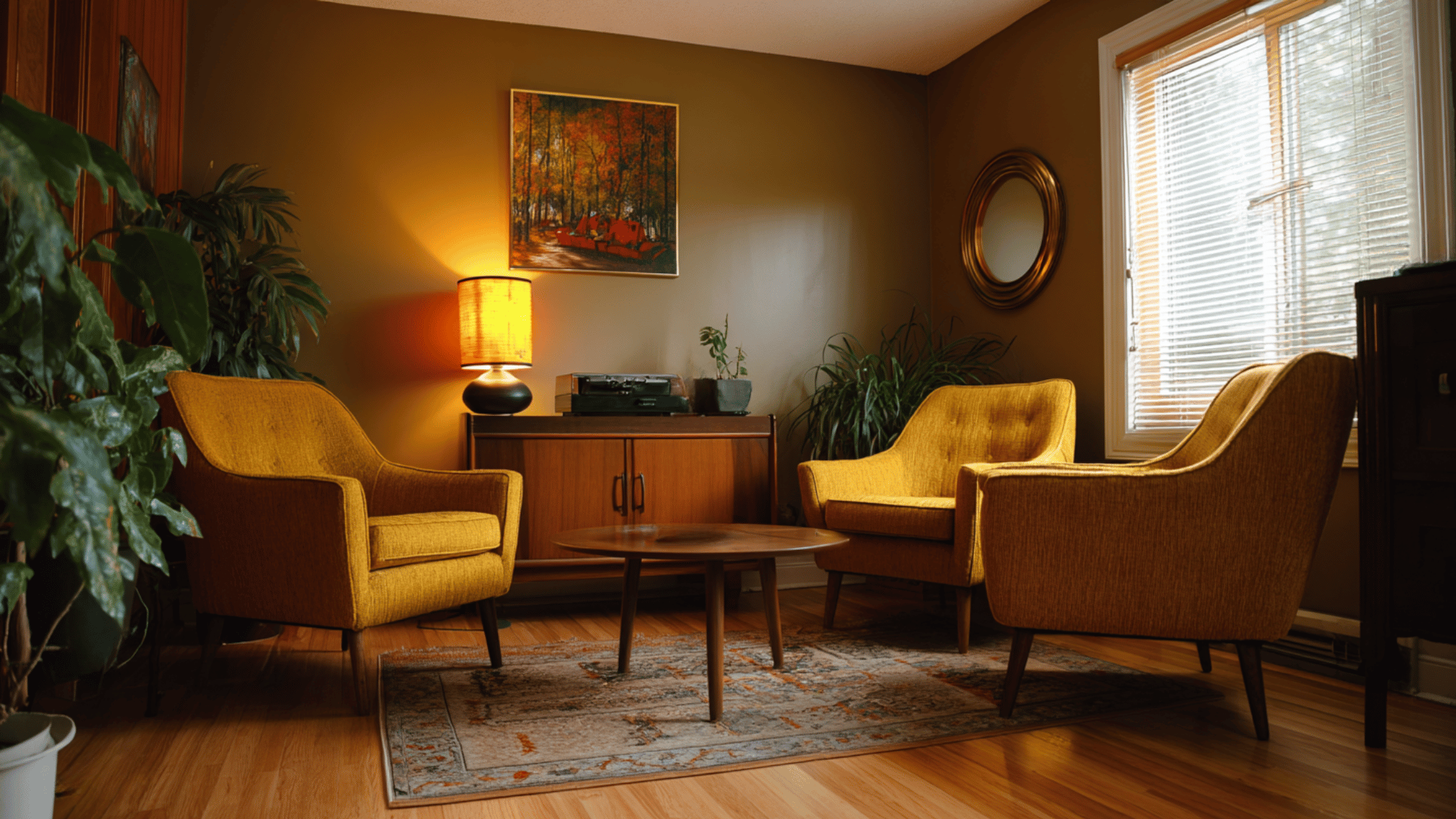
This combination brings warmth and depth to any room. Mustard yellow adds vibrancy, while olive green grounds the palette with a natural touch.
Perfect for living rooms or kitchens, these shades pair beautifully with wooden textures and neutral fabrics.
It creates a cozy, vintage-inspired atmosphere that feels both welcoming and earthy.
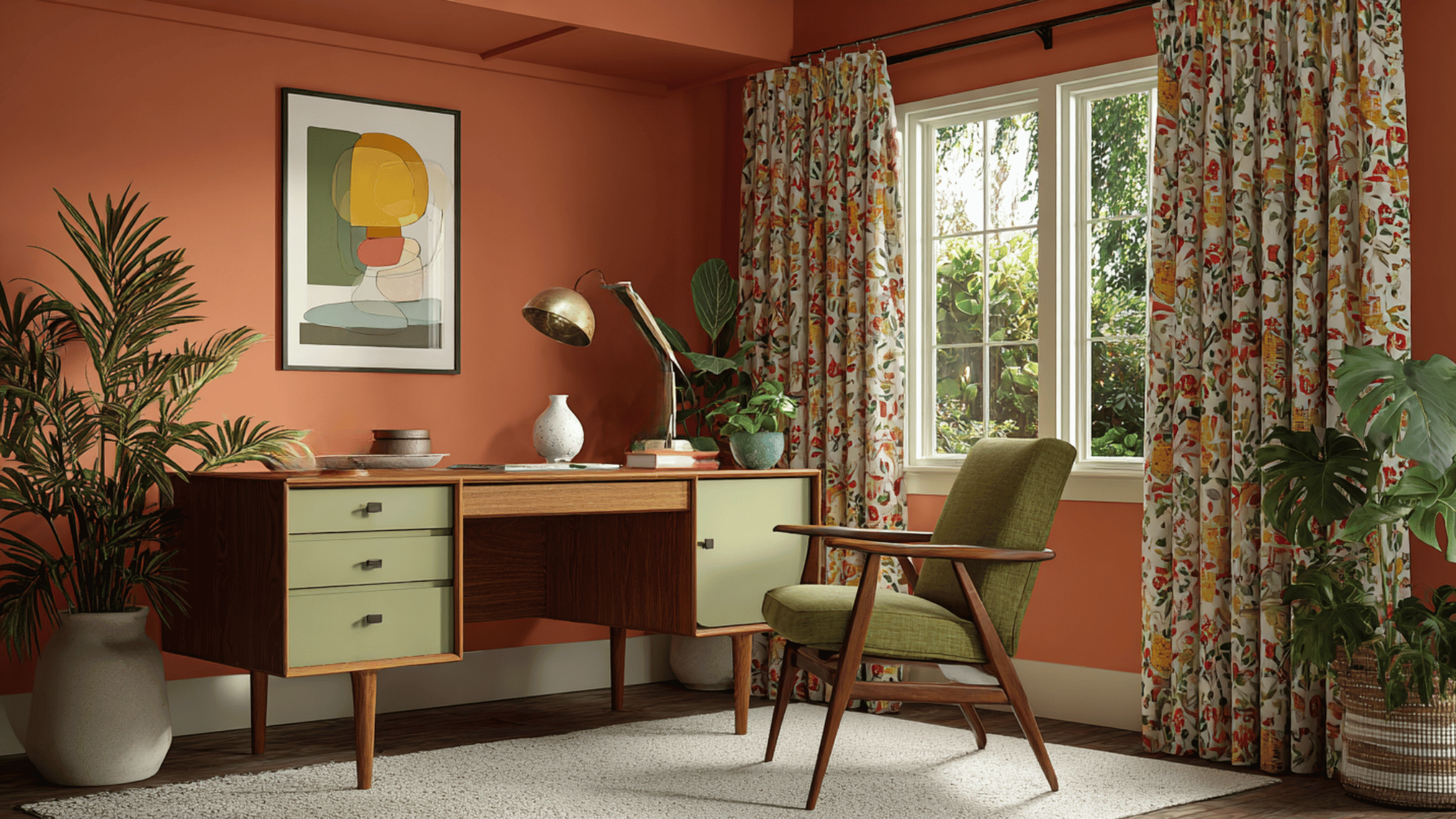
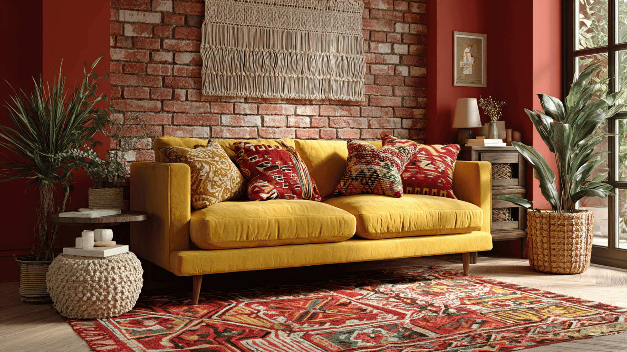
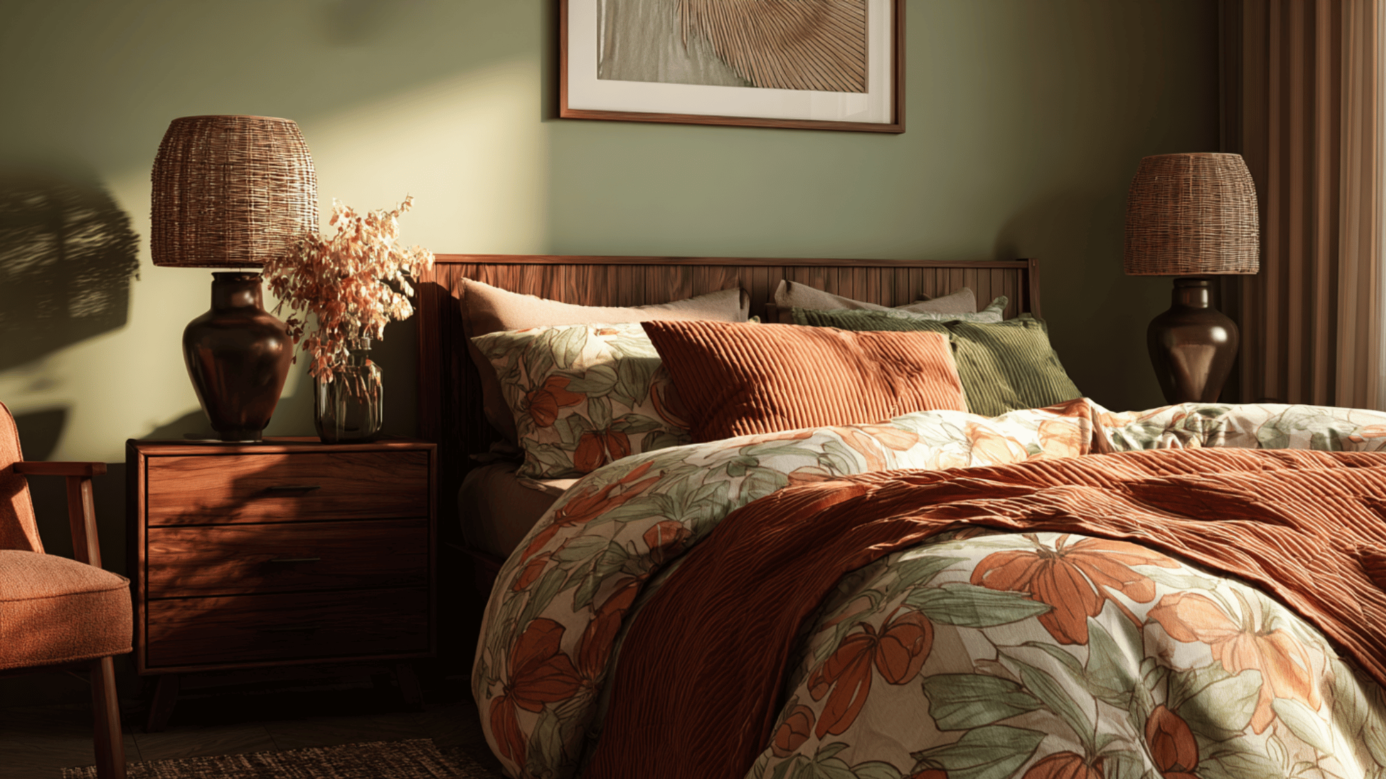
2. Burnt Orange and Cream
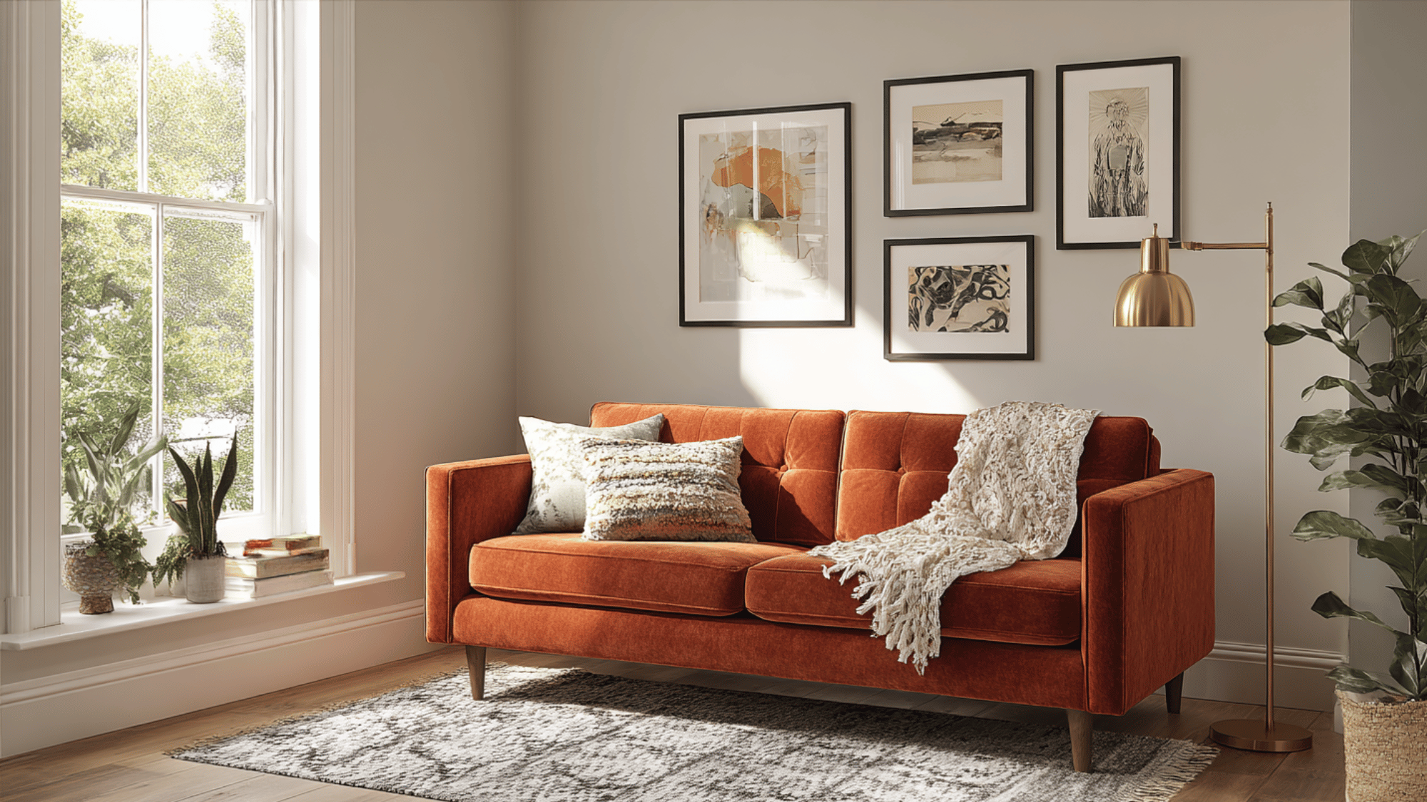
Burnt orange radiates retro beauty and warmth, while cream softens the look with balance and brightness.
Together, they create an inviting contrast that feels nostalgic yet classic.
Ideal for accent walls or upholstery, this pairing works especially well in spaces designed for relaxation and creativity.
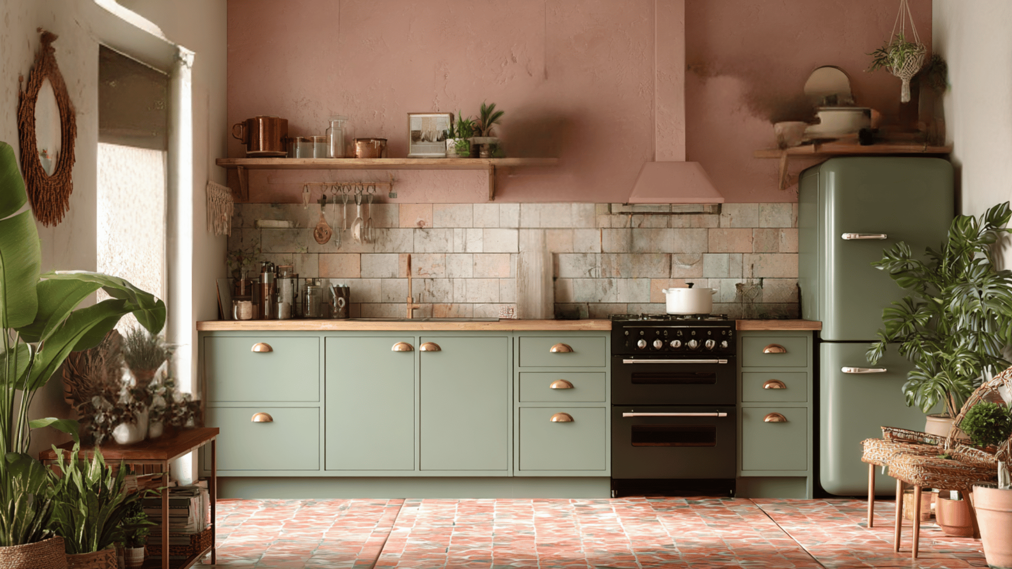
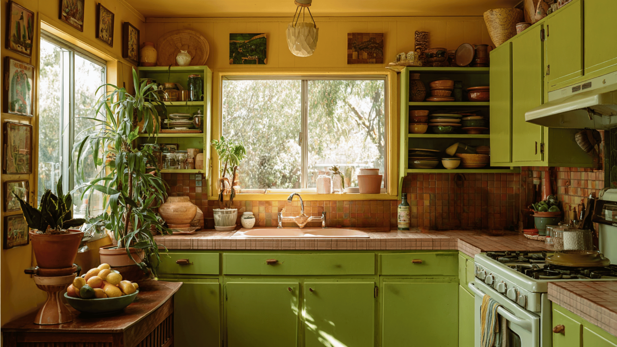
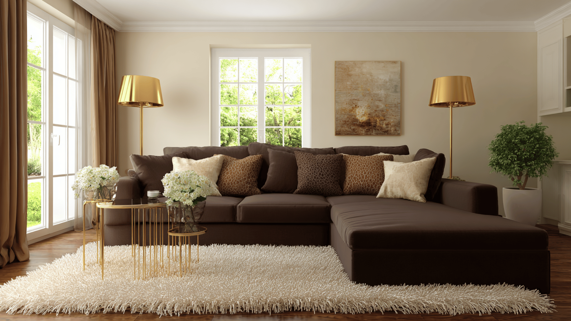
3. Avocado Green and Brown
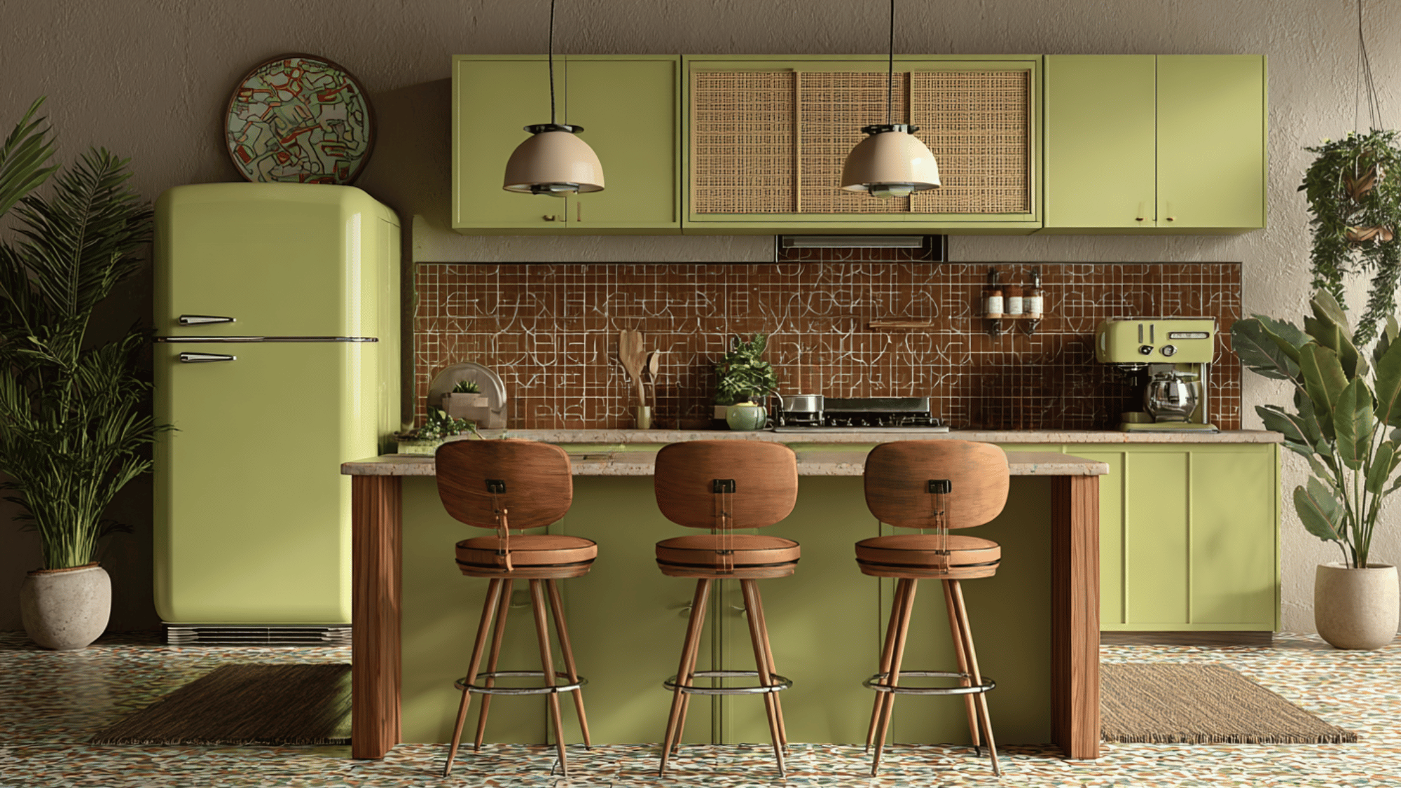
This iconic 70s color pairing combines avocado green’s fresh, earthy energy with stable, comforting brown tones.
Popular in furniture, appliances, and wall decor, the combo creates a grounded, organic ambiance reflective of the decade’s biophilic design trend.
Paired with natural wood finishes, it defines retro interiors that celebrate ecological connection and relaxed comfort, making spaces feel cozy and inviting.
4. Rust and Mustard Yellow
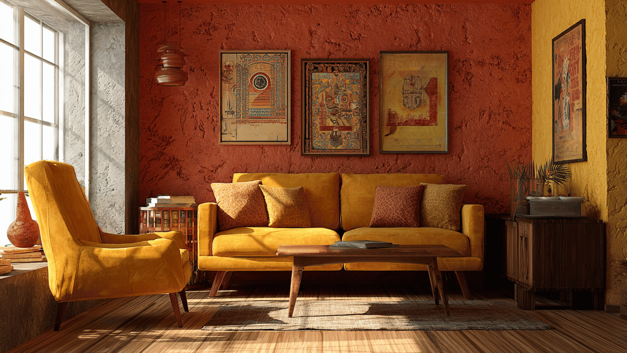
Rust’s warm, rich undertones blend harmoniously with mustard yellow’s vibrant, sunny personality, capturing the retro beauty of autumnal color palettes.
This duo was popular for textiles like curtains and throw pillows as well as accent walls. Together, they bring depth and character to interiors without overwhelming them.
This combination conjures nostalgia for mid-century modern and bohemian things, adding warmth and a welcoming glow to living spaces while staying visually engaging.
5. Chocolate Brown and Burnt Sienna
Deep and earthy, chocolate brown provides a grounding base complemented by the warm, reddish tones of burnt sienna.
This color duo is perfect for cozy, intimate spaces like dens or reading nooks, evoking a sense of modernized and natural richness.
The combination encapsulates the 70s vintage vibe with its earthy hues that remain classic for creating comforting and stylish home environments.
6. Harvest Gold and Teal
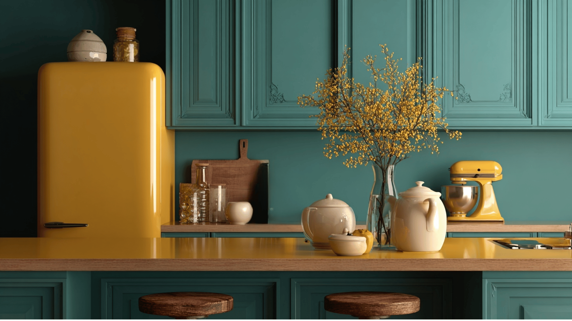
This lively mix pairs the warm, golden-yellow vibrancy of harvest gold with the cool, soothing depth of teal.
Popular in the 1970s, it’s a striking balance of cheerfulness and calm, ideal for retro kitchens and modern boho living rooms alike. The contrast creates an inviting environment that feels both nostalgic and fresh.
Harvest gold radiates warmth and abundance, while teal adds modernity and tranquility, making this duo versatile and classic.
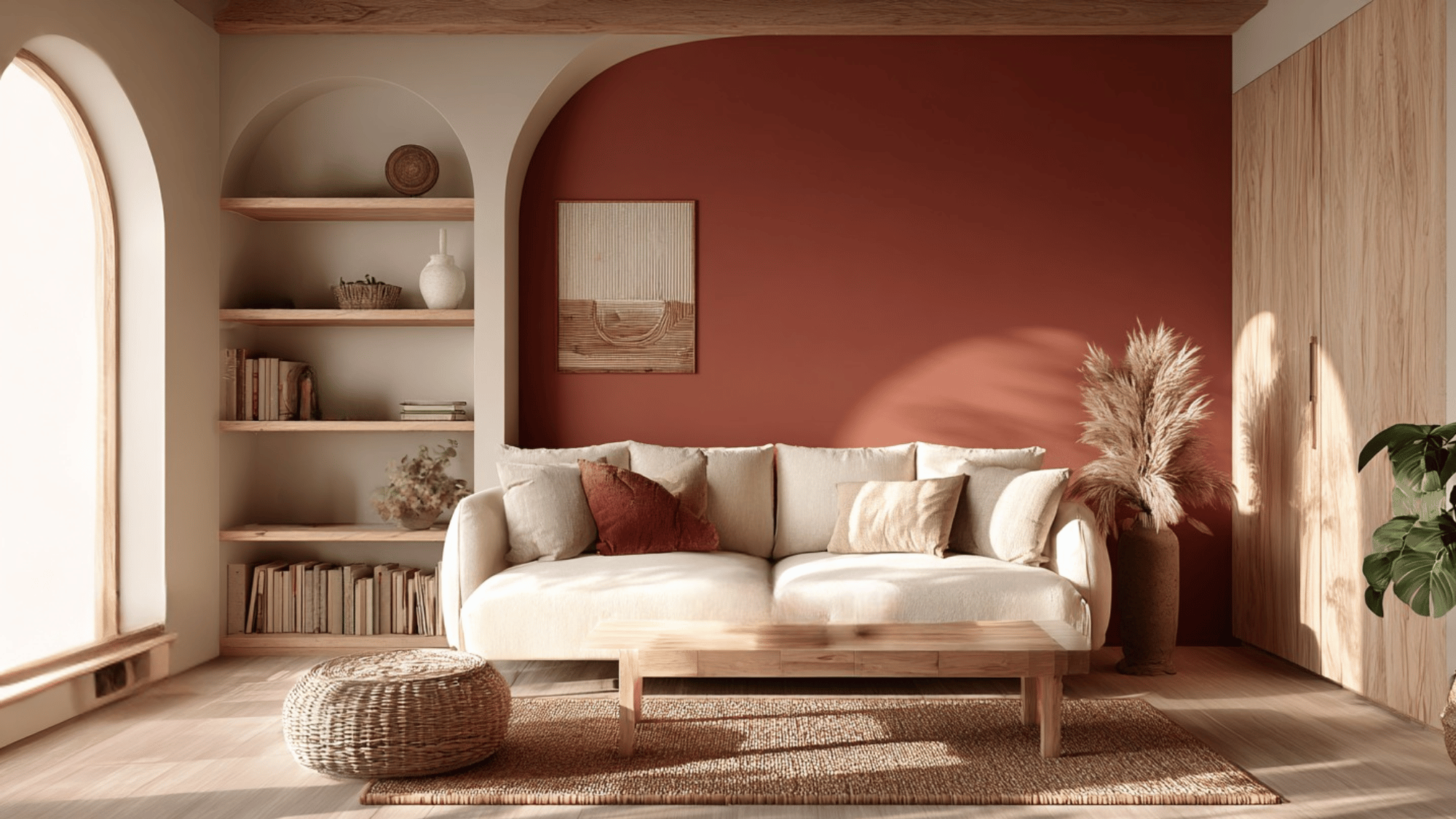
7. Terracotta and Beige
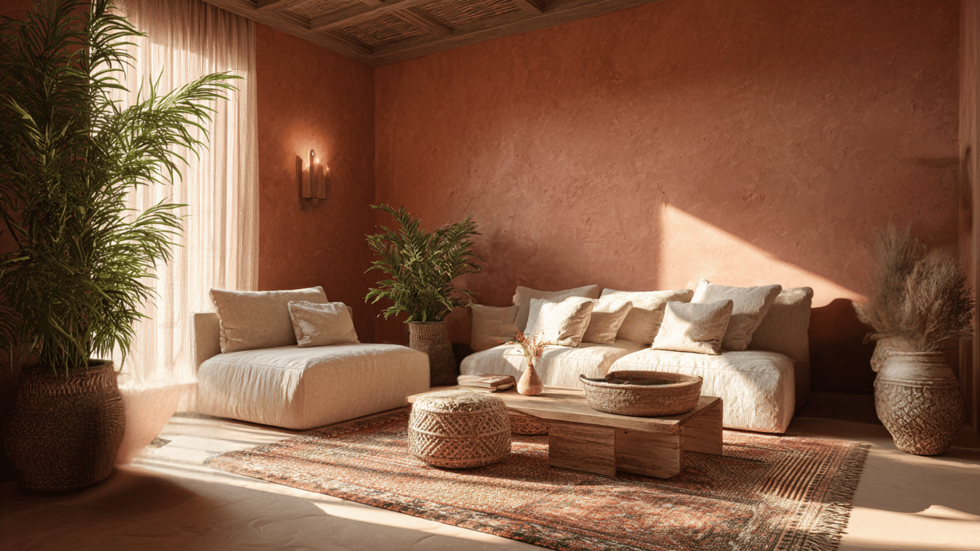
Terracotta’s earthy, sunbaked orange shades blend naturally with soft, neutral beige, evoking Mediterranean warmth and beauty.
This pairing creates a serene, grounding atmosphere perfect for minimal retro décor with bohemian flair.
The warmth of terracotta adds a touch of boldness balanced by beige’s subtle calm, making interiors inviting yet understated.
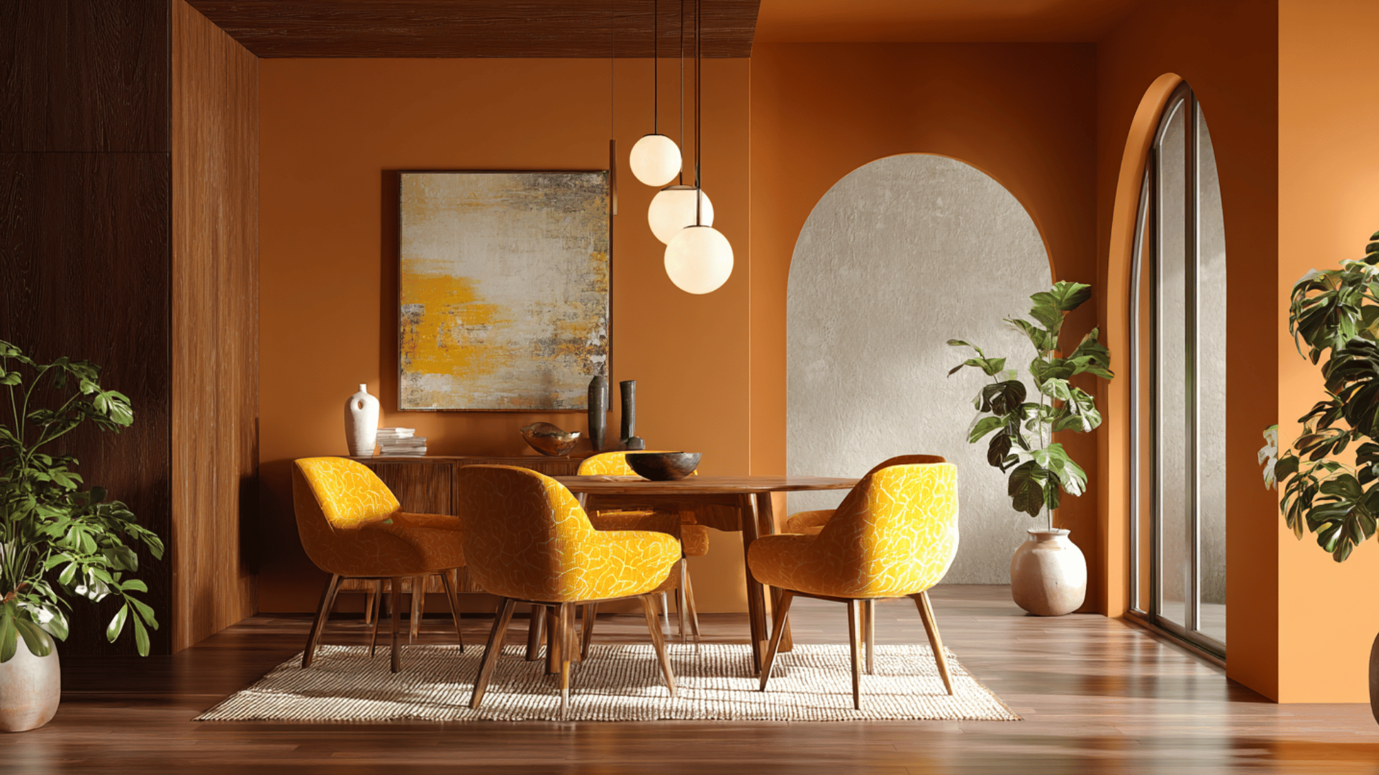
8. Marigold and Deep Brown
Marigold’s bright, sunny hue pairs vibrantly with deep brown’s rich, modernized, crafting a warm, comforting retro palette.
This color combination is perfect for living rooms or dining spaces that aim for cozy, stylish, with a nostalgic touch.
Marigold energizes and livens up interiors, while deep brown grounds add depth. These colors resonate with 70s interior trends, emphasizing warmth, character, and a welcoming ambiance.
9. Olive Green and Burnt Orange
This bold retro pairing channels the adventurous spirit of 1970s design. Olive green offers a calm, earthy base, while burnt orange injects energy and vibrancy.
Together, they generate a dynamic yet cozy feel perfect for eclectic or vintage-inspired spaces.
Their complementary nature strikes a balance between nature-inspired grounding and lively warmth, making them excellent for accent walls, textiles, or statement furniture in period or modernized interiors.
10. Mustard Yellow and Navy Blue
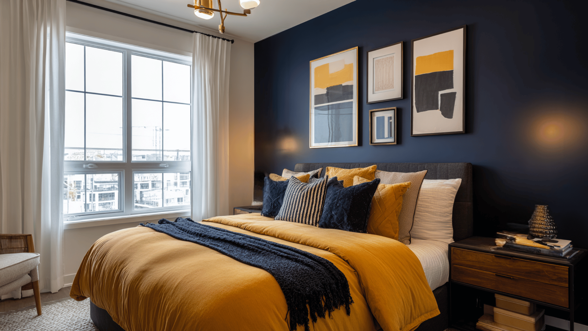
Mustard yellow’s cheerful warmth combines with navy blue’s cool, confident depth to create a balanced, striking palette.
This duo is ideal for modern retro interiors, where the bright and earthy tone enlivens the room while the dark blue adds modernized and stylish.
The pairing caters to both energy and stability, making it useful across various living spaces from lounges to kitchens, perfectly echoing 70s style with a contemporary edge.
11. Rust and Cream
Rust brings a warm, earthy tone full of character, while cream introduces balance with its softness and brightness.
This pairing is ideal for bedrooms or living rooms where a cozy yet lively atmosphere is desired.
When combined with wooden furniture or brass accents, rust and cream create an inviting, stylish space that feels classic.
12. Avocado Green and Terracotta
This earthy duo combines the fresh vibrancy of avocado green with the warm, sun-kissed tones of terracotta, creating a natural and organic feel.
Perfect for plant-filled interiors or bohemian-inspired spaces, the colors evoke a harmonious connection to nature.
The pairing balances cool and warm tones, making interiors feel grounded and lively. It’s a stylish nod to 70s retro design while remaining relevant for contemporary, nature-forward decor.
13. Brick Red and Tan
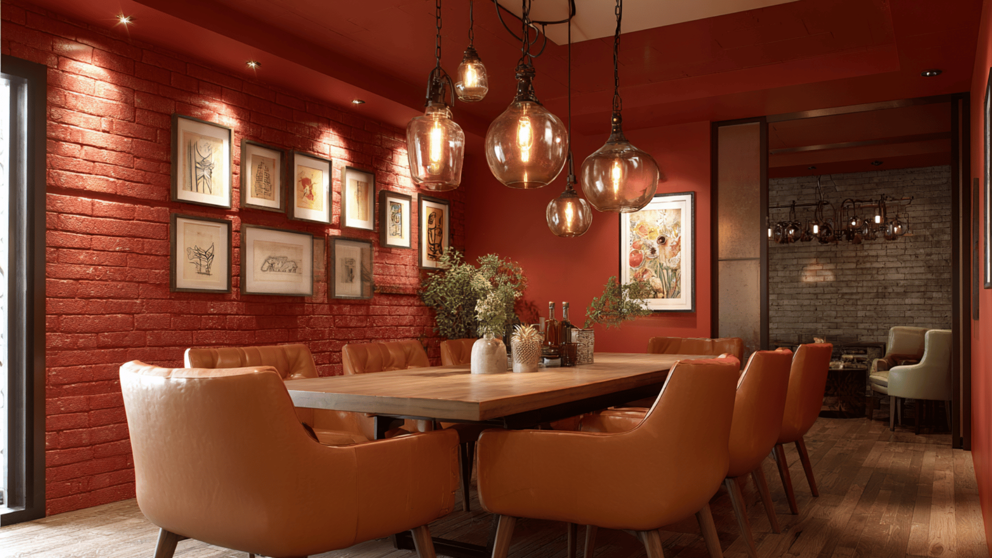
Brick red’s rustic warmth, combined with soft tan’s neutral foundation, delivers a cozy and textured retro things .
This combination works well in living rooms and dining areas, adding depth and a welcoming ambiance.
The contrast between bold brick red and calming tan creates visual interest without overpowering.
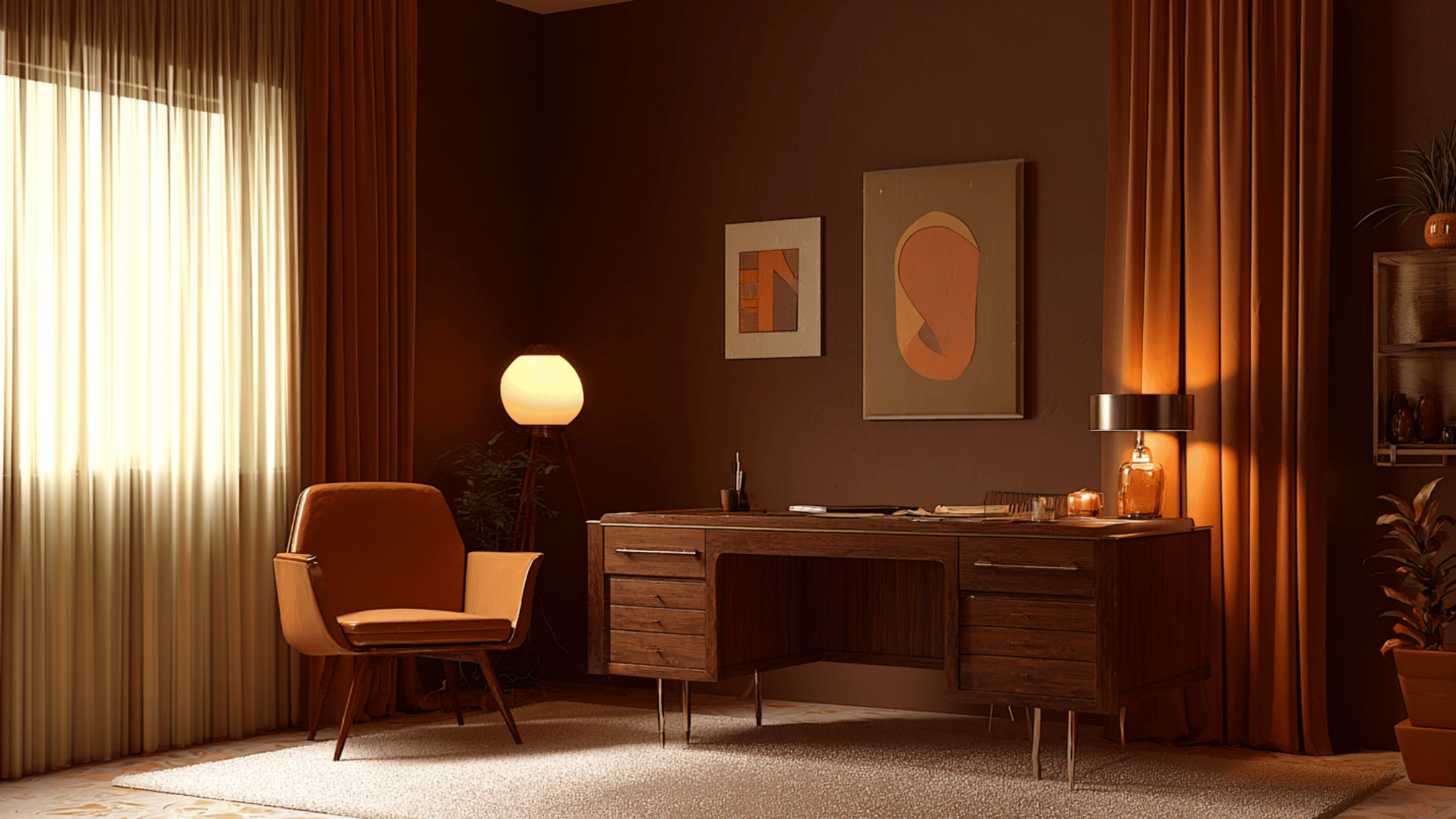
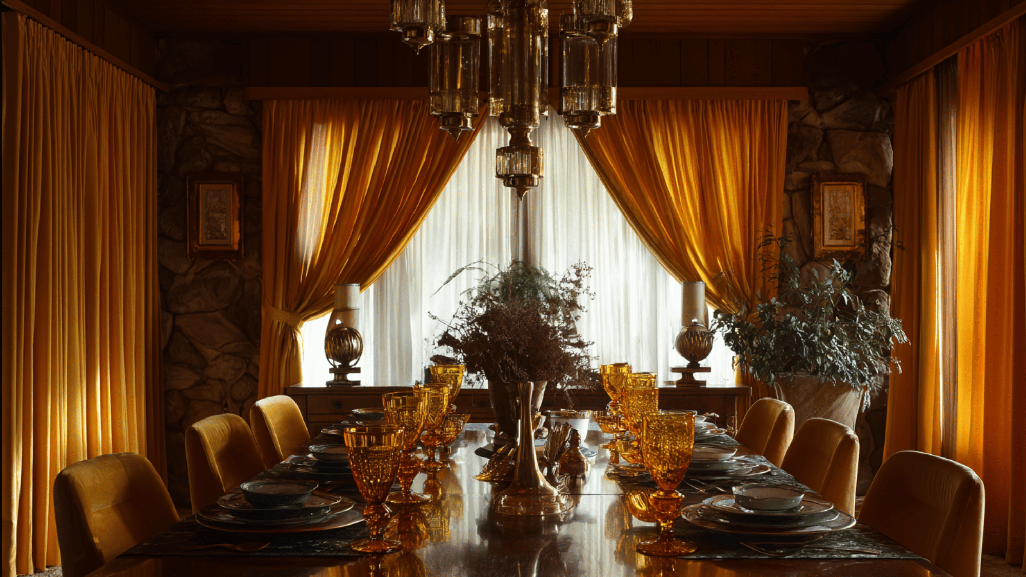
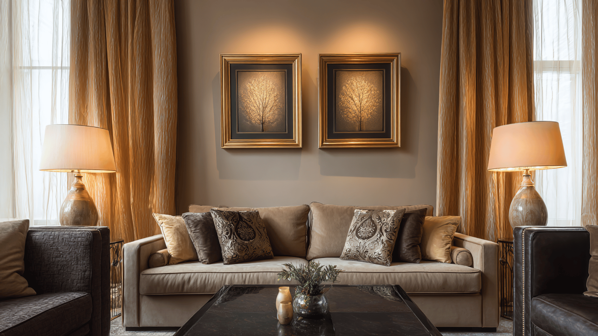
14. Gold and Chocolate Brown
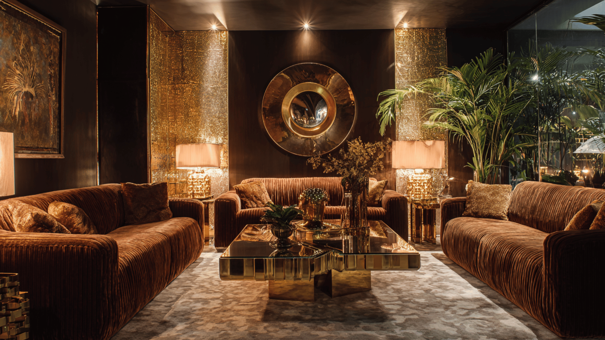
Gold’s shimmering luster pairs beautifully with the deep richness of chocolate brown, producing a look that’s luxurious yet grounded.
This combination is perfect for glamorous 70s-inspired interiors that emphasize style and warmth.
Metallic accents and textured fabrics complement these colors, adding layers of modernization. The palette balances opulence with comfort, making it ideal for creating inviting yet upscale living spaces.
15. Pumpkin Orange and Sage Green
Pumpkin orange offers cheerful warmth and vibrancy, while sage green contributes a calming, nature-inspired tone.
This combination is perfect for kitchens or creative spaces seeking a balance of energy and tranquility. The earthy yet lively duo reflects the outdoors and brings freshness inside.
Their harmonious contrast improves ambiance without clashing, making it a favorite for retro and bohemian designs aiming for a welcoming, grounded atmosphere.
16. Mustard Yellow and Charcoal Gray
This pairing modernizes the retro mustard yellow with modernized charcoal gray, creating a dynamic balance between warmth and grounding neutrality.
The bright, optimistic mustard yellow invigorates spaces, while charcoal gray adds depth and urban stylish.
Ideal for contemporary and vintage-inspired interiors, this combo works well in living rooms or offices seeking a stylish yet inviting atmosphere, blending energy with understated refinement for a versatile and bold statement.
17. Copper and Cream
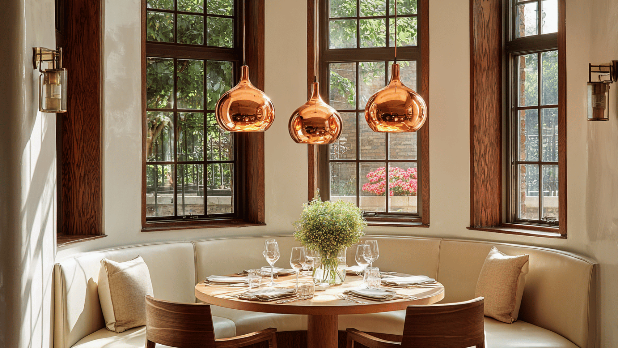
Copper’s metallic warmth adds a subtle, glowing richness contrasted by the softness and brightness of cream. This combination exudes cozy modernized, perfect for dining rooms or chic retro spaces.
It celebrates natural textures and light, creating a welcoming environment that blends rustic beauty with style.
Copper accents paired with cream walls or upholstery offer a classic, upscale look suitable for both vintage-inspired and modern interiors.
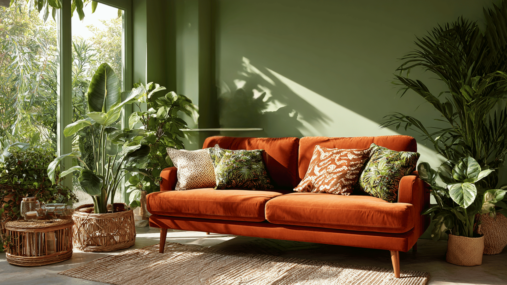
18. Burnt Orange and Olive Green
This earth-toned duo captures nature’s harmonious contrast, with burnt orange providing vibrant energy while olive green offers a calming, grounded tone.
Popular in mid-century and 70s design, this pairing adds retro character to spaces like living rooms and kitchens.
It evokes organic warmth and balance, creating inviting, eclectic interiors that refresh with vintage flair while connecting strongly to natural elements.
19. Sand Beige and Walnut Brown
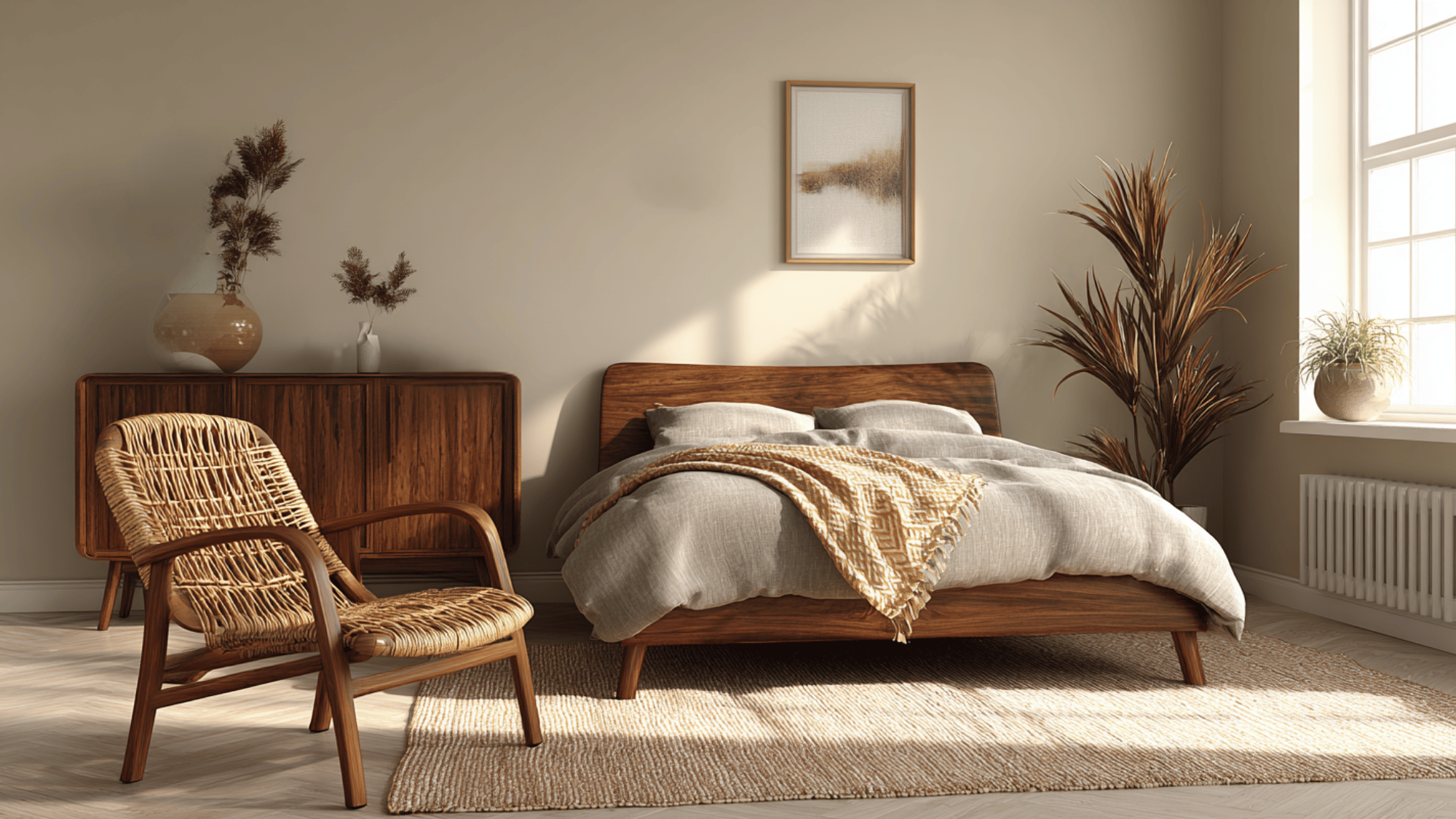
Sand beige offers airy lightness balanced by walnut brown’s rich depth, combining for a modernised, earthy palette.
Perfect for minimalist retro designs, the colors harmonize with natural wood and woven textures. This duo creates classic, calming interiors that are warm yet understated, evoking both comfort and style.
Its subtle warmth and neutrality make it versatile for various rooms, boosting cozy yet refined things.
20. Mustard Yellow and Brick Red
A lively but grounded palette, mustard yellow’s golden warmth pairs beautifully with rustic brick red’s deep richness. This combination is ideal for creating cozy, vibrant interiors.
Widely used in 70s décor, it infuses spaces with energy and warmth while maintaining a sense of earthiness.
The pairing is perfect for accent walls, textiles, or décor pieces that radiate welcoming character and nostalgic beauty.
21. Avocado Green and Ochre
This lush, organic palette blends avocado green’s muted vibrancy with the earthy warmth of ochre.
They create a vintage vibe reminiscent of retro kitchens or cozy living rooms filled with personality and comfort. The combo evokes natural elements and classic beauty, making spaces inviting and grounded.
It’s perfect for those aiming to inject a nostalgic yet fresh feel into interiors, pairing beautifully with wooden furnishings and textured fabrics.
22. Rust and Denim Blue
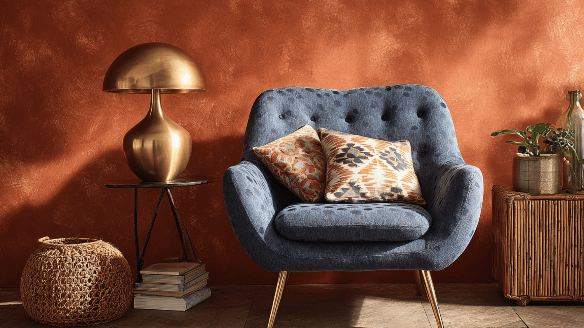
Rust’s warm undertones harmonize with the cool calm of denim blue, forming a balanced nostalgic combination.
This pairing recalls the laid-back vibe of 70s casual living spaces, bringing both energy and relaxation. It works well in upholstery, accent walls, or decor pieces, adding depth without overwhelming.
The contrast between warm rust and soft denim blue creates spaces that feel cozy and classically stylish, perfect for vintage or eclectic interiors.
23. Pumpkin and Olive Brown
Pumpkin’s bright, cheerful tones contrast beautifully with olive brown’s earthy richness, resulting in a warm, vintage feel.
This duo is ideal for energizing textiles, throw blankets, or accent walls in retro-inspired rooms. Their organic harmony brings warmth and coziness, evoking the spirit of 70s design.
The blend of lively orange and subdued brown adds depth and comfort, perfect for spaces aiming for both vibrancy and earthiness.
24. Amber and Mocha
Amber offers a soft, golden glow that pairs beautifully with mocha’s deeper, grounded tones.
This combination creates a subtle, inviting atmosphere suited for warm-toned interiors like lounges or bedrooms. The warmth of amber lightens up the mocha base, balancing richness with brightness.
They evoke a stylish and comfortable, ideal for spaces embracing a retro yet modernised look, enhanced by plush textures and natural materials.
25. Burnt Sienna and Mustard
This bold and friendly pairing combines burnt sienna’s depth with mustard yellow’s brightness to create a dynamic retro palette.
It’s perfect for dining or creative spaces that need warmth and personality. Burnt sienna adds earthiness and modernity, while mustard enlivens the space with cheerful energy.
Together, they channel 70s character and beauty, making interiors feel vibrant and welcoming without overwhelming the senses.
26. Chocolate Brown and Cream
Chocolate brown offers a rich, warm base that exudes classic style, while cream introduces softness and brightness, creating a balanced, cozy vibe.
This classic 70s combination is ideal for living rooms, bedrooms, or reading corners seeking modernization without heaviness.
The cream tones soften the dark richness of chocolate brown, amplifying light and airiness. They create inviting spaces that are both stylish and comforting, a perfect blend of vintage beauty and modern warmth.
27. Olive Green and Coral
This refreshing pairing combines olive green’s earthy, grounded feel with coral’s lively, playful energy.
The duo brings a vibrant contrast perfect for injecting life into neutral or muted interiors. Olive green provides warmth and depth, while coral enlivens the space with its bright, cheerful hue.
Ideal for accent pieces, textiles, or feature walls, this combination merges retro sensibility with contemporary freshness, creating spaces that are both welcoming and dynamic.
Using the 70s Color Palette in Modern Design
The 70s color palette blends vintage warmth with contemporary style, offering endless possibilities for creating inviting, character-filled spaces in today’s homes and designs.
- Interior Design: Use warm tones like mustard yellow and avocado green in furniture, rugs, or wall art. These colors create cozy, nostalgic interiors that still feel modern and inviting.
- Graphic Design: Incorporate muted oranges, browns, and creams in posters or branding. These shades add vintage flair while maintaining a clean, contemporary appeal perfect for modern audiences.
- Fashion & Textiles: Blend retro hues into patterned fabrics, such as stripes or florals. Pair bold colors with neutral pieces to create balanced, stylish outfits inspired by 70s fashion.
- Home Accents: Mix bold retro colors with sleek materials like metal or glass. This balance keeps the look fresh and avoids overwhelming the space with too much vintage intensity.
Conclusion
The 70s color palette continues to inspire designers and creators with its rich blend of warmth, individuality, and natural beauty.
Its earthy tones and bold contrasts offer endless possibilities for reimagining spaces, art, and fashion with a nostalgic twist.
By combining these vintage hues with modern simplicity, one can achieve a balanced and classic look.
The retro color palette not only revives the spirit of the past but also aligns with today’s love for authenticity, comfort, and sustainable living, proving that style from the seventies truly stands the test of time.