Choosing paint colors can feel overwhelming. Agreeable Gray has become a go-to neutral; this warm greige works beautifully in most spaces, yet it truly shines when paired with the right companions.
Understanding which colors complement Agreeable Gray changes a room from simply nice to genuinely stunning.
The right combinations create depth, warmth, and visual interest that make a space feel both polished and inviting. This guide finds the best coordinating colors for Agreeable Gray interiors.
Readers will learn practical pairing ideas, from subtle tone-on-tone schemes to striking contrasts that bring rooms to life. Let’s find the perfect palette for any space.
Understanding Agreeable Gray as a Neutral Greige
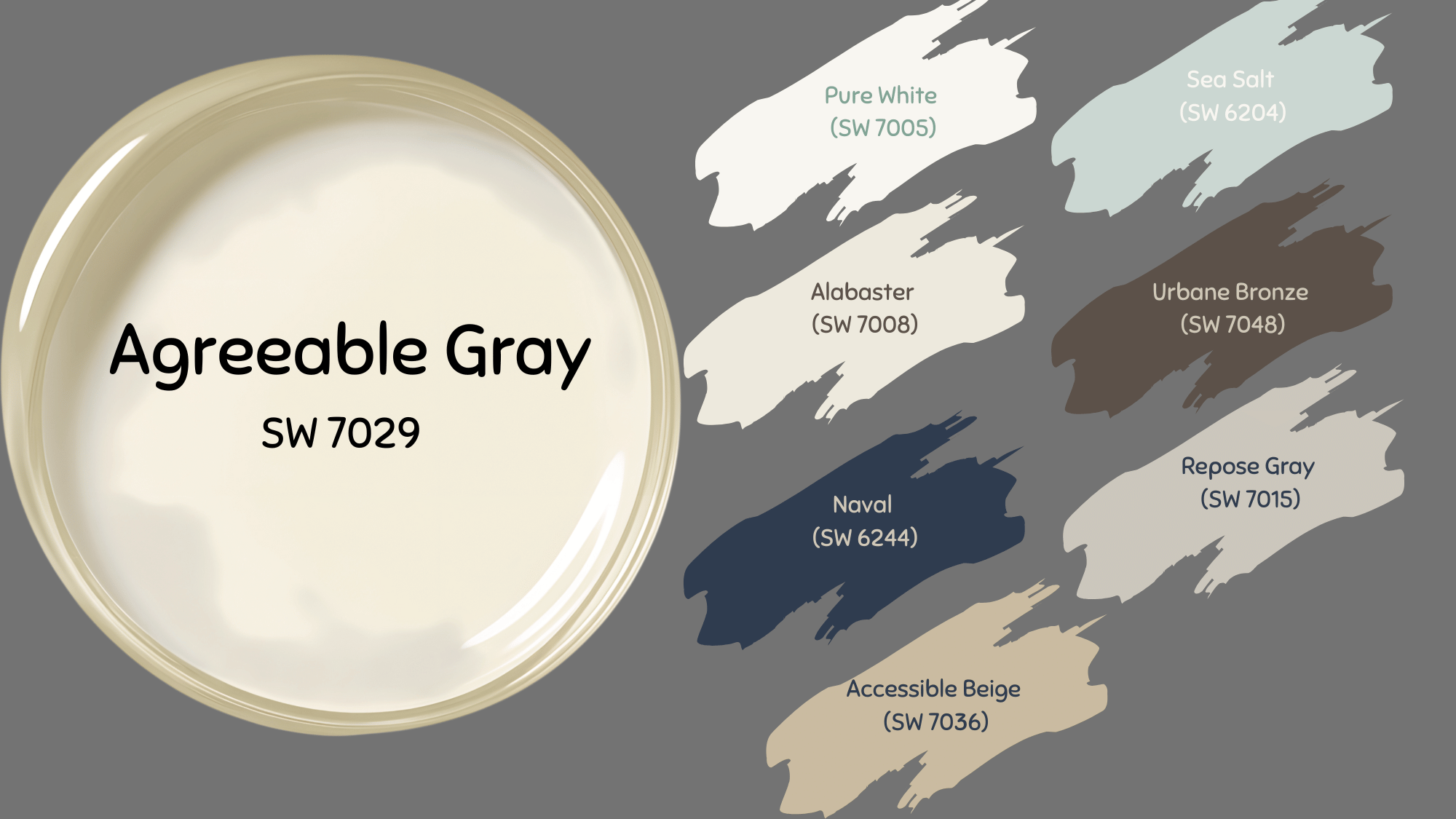
Introduced by Sherwin-Williams, Agreeable Gray (SW 7029) has become one of the brand’s most popular paint colors since its inception.
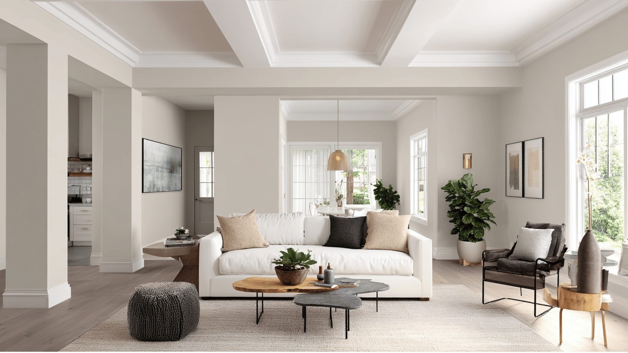
Known for its balanced blend of warm beige and cool gray, this timeless greige complements any style, from modern to traditional, creating spaces that feel calm, inviting, and effortlessly classy.
To learn more about the buying options of this shade, visit the official site of Sherwin-Williams.
| Specification | Details |
|---|---|
| Paint Name | Agreeable Gray |
| Paint Code | SW 7029 |
| Color Family | Greige (Gray + Beige) |
| Undertones | Warm beige with subtle green and violet-gray hints |
| Light Reflectance Value (LRV) | 60 |
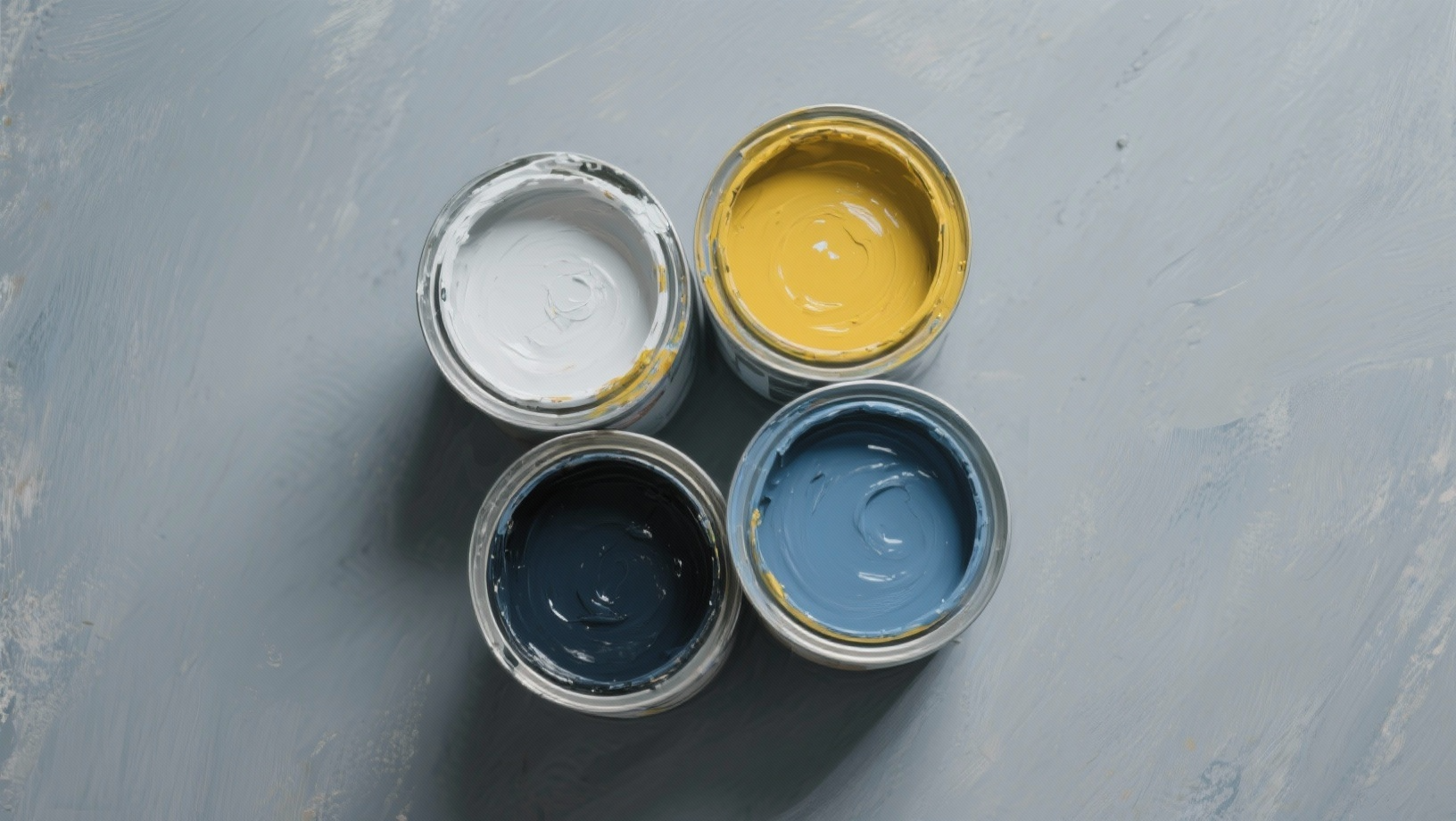
Best Coordinating Colors with Agreeable Gray
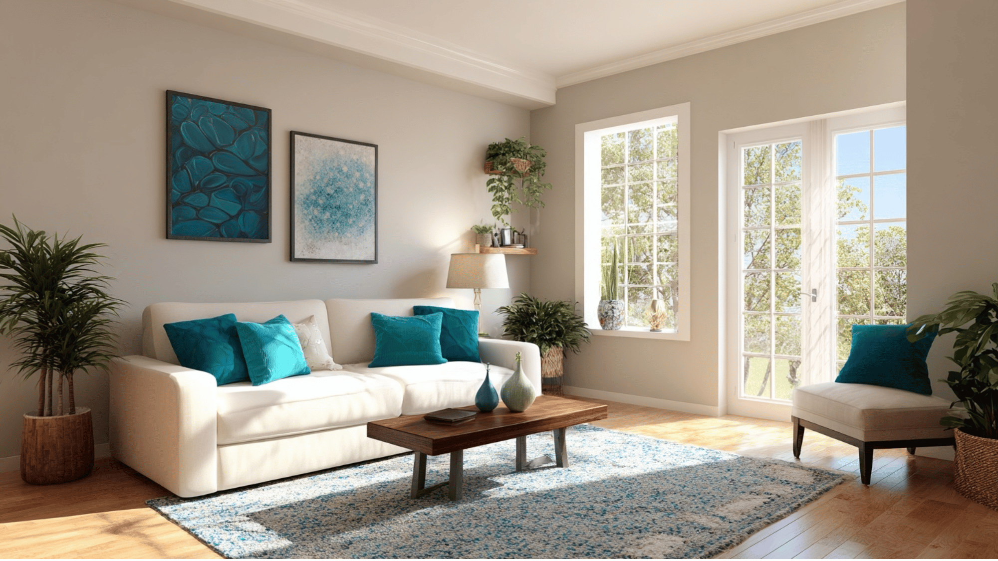
Agreeable Gray’s soft greige undertone makes it incredibly versatile. It pairs beautifully with both warm and cool hues, creating balanced interiors that feel cohesive and inviting in any space.
1. Pure White (SW 7005)
Pure White creates a crisp, clean contrast against Agreeable Gray. This pairing highlights trim, ceilings, and cabinetry beautifully, bringing a sense of freshness and definition to any room.
The white amplifies natural light, making spaces feel open and airy while allowing Agreeable Gray’s subtle warmth to stand out.
Ideal for modern, transitional, or farmhouse interiors, this duo delivers a refined and balanced aesthetic that never feels stark or cold.
2. Sea Salt (SW 6204)
Sea Salt’s soothing blend of green and gray undertones pairs effortlessly with Agreeable Gray’s neutral warmth.
Together, they form a serene and spa-like palette perfect for bedrooms, bathrooms, or coastal-inspired spaces. The combination evokes calmness and harmony, especially in natural light.
Sea Salt adds a touch of color without overwhelming, while Agreeable Gray anchors the palette with timeless sophistication and balance.
3. Alabaster (SW 7008)
Alabaster’s soft, creamy white complements the Agreeable Gray greige base, creating a subtle, harmonious transition between walls and trim.
This pairing produces a warm, inviting environment ideal for living rooms or entryways. Alabaster’s undertones enhance Agreeable Gray’s depth while maintaining a light, airy feel.
The result is a cozy space perfect for homes seeking both brightness and warmth.
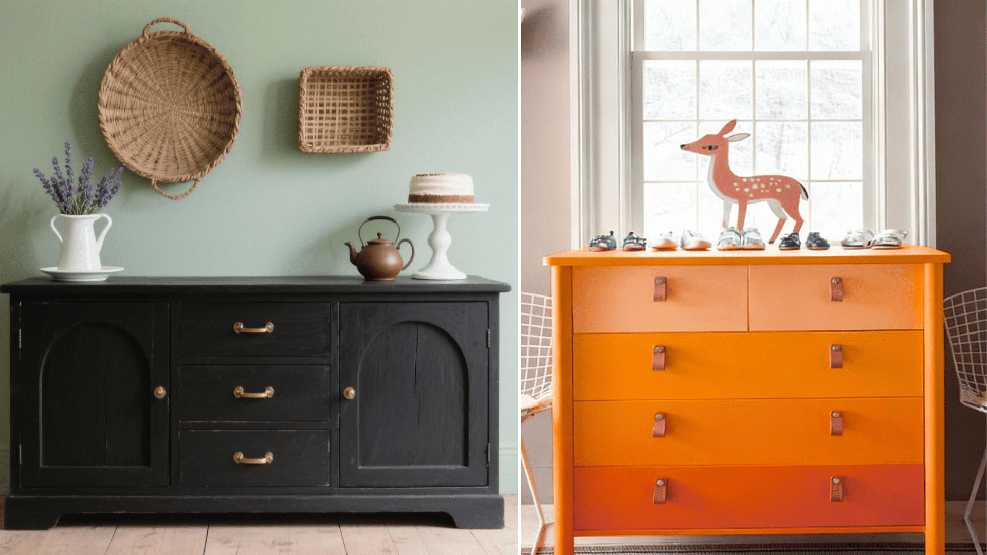
4. Urbane Bronze (SW 7048)
For a bold and contemporary touch, Urbane Bronze makes a stunning accent alongside Agreeable Gray. Its deep brown-gray tones add contrast and ground lighter walls with dramatic depth.
This combination works beautifully in studies, dining rooms, or accent walls.
Urbane Bronze emphasizes Agreeable Gray’s softer qualities while creating a cozy, luxurious atmosphere that feels modern yet classic. Together, they balance warmth and strength flawlessly.
5. Naval (SW 6244)
Naval’s rich navy tone brings a sense of elegance and calm when paired with Agreeable Gray. This duo creates depth and character perfect for bedrooms, offices, or accent features.
The deep blue contrasts beautifully with the greige base, providing visual interest without overwhelming the space.
Add brass, gold, or natural wood accents to amplify the refined coastal or transitional look this pairing achieves.
6. Repose Gray (SW 7015)
Repose Gray and Agreeable Gray belong to the same family, making them effortless companions.
Use Repose Gray for adjoining rooms or accent walls to create subtle tonal variation. This combination enhances the flow between spaces while maintaining a cohesive, monochromatic look.
The pairing works exceptionally well in open-concept homes, offering balance and depth without harsh contrast, a refined choice for modern, understated interiors.
7. Accessible Beige (SW 7036)
Accessible Beige brings warmth and coziness to Agreeable Gray’s balanced neutrality.
Together, they form a soft, inviting palette ideal for living areas, bedrooms, or hallways. This combination bridges the gap between warm and cool tones, allowing space for versatile decor and materials.
The result is a harmonious, welcoming space that feels grounded yet airy, appealing to both traditional and contemporary styles.
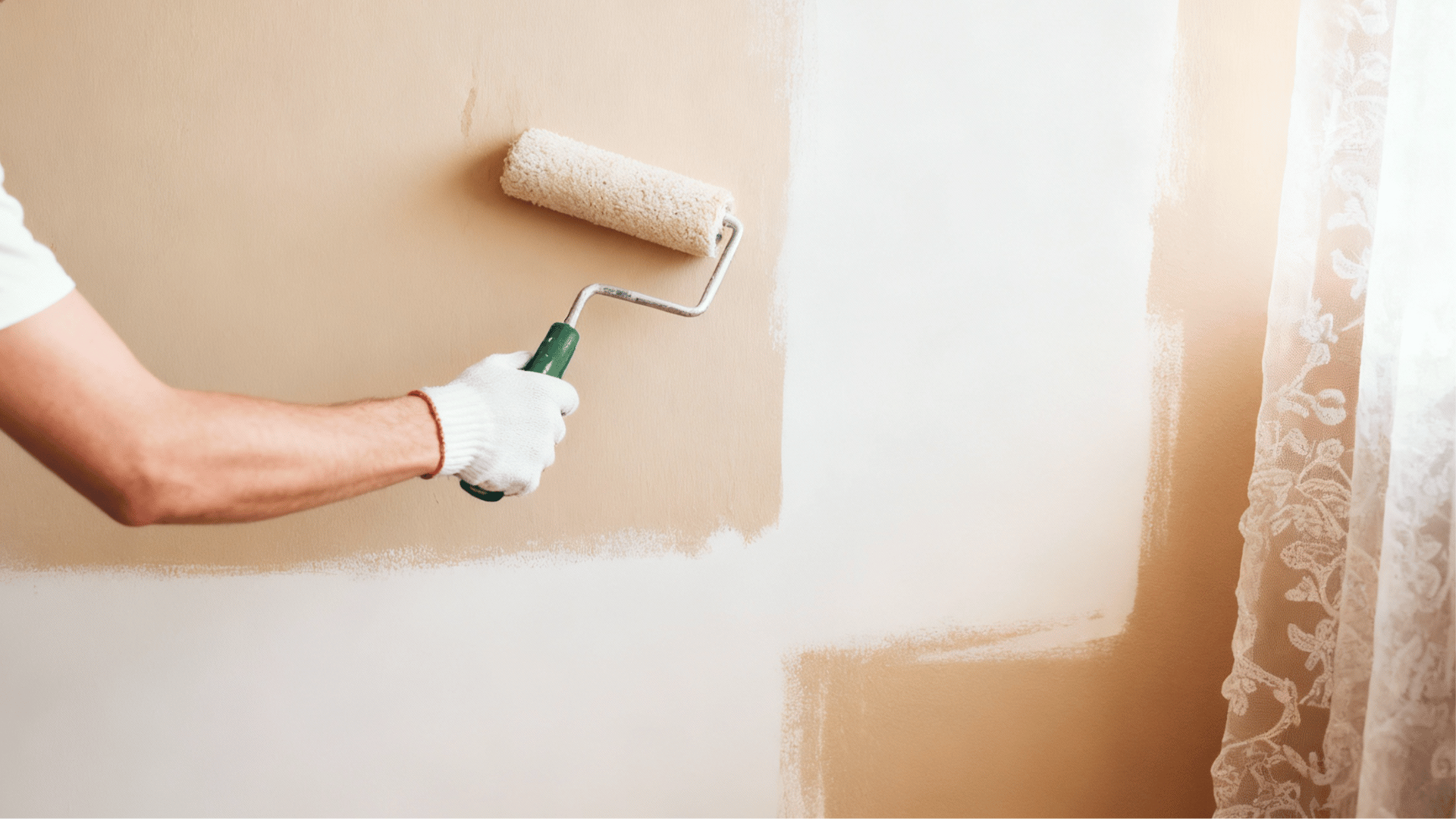
How to Use Coordinating Colors in Home Design
Understanding color coordination makes decorating less stressful and more enjoyable. The process starts with identifying a base color, like Agreeable Gray, then building around it.
Designers often use the 60-30-10 rule. The dominant color covers 60% of the space, a secondary shade takes 30%, and an accent color fills the remaining 10%. This creates balance without overwhelming the senses.
Testing paint samples in actual lighting conditions is crucial. Colors look different at various times of day, and what works in morning light might feel off by evening.
Coordinating colors should complement each other while serving different purposes. Some add warmth, others provide contrast, and a few simply tie everything together beautifully.
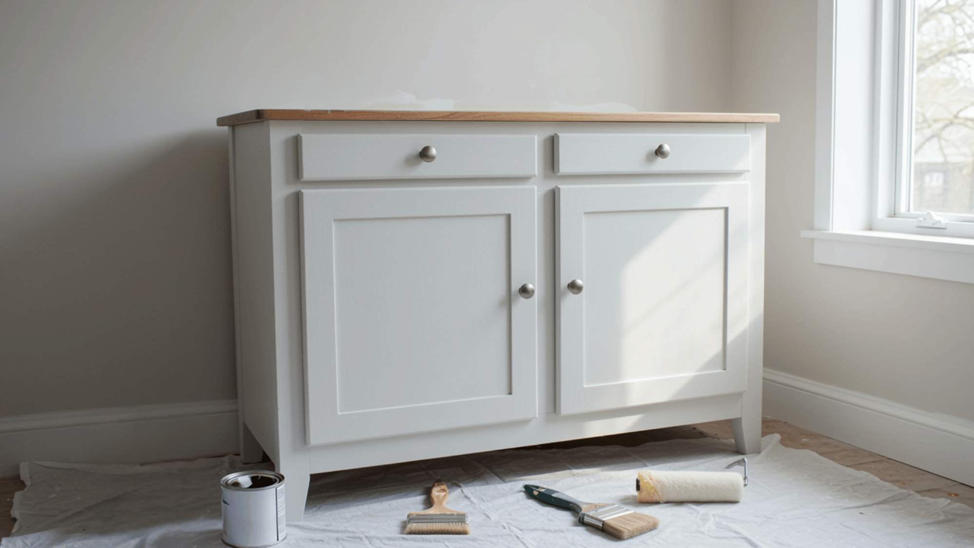
Additional Elements to Amplify Agreeable Gray Schemes
Beyond paint colors, various design elements enhance Agreeable Gray spaces. Textures, materials, and finishes work together to create layered, interesting rooms that feel complete and cohesive.
- Natural wood tones: Oak, walnut, and maple add warmth and organic texture, preventing the space from feeling too sterile or cold.
- Metallic accents: Brushed-nickel, brass, or matte-black fixtures provide subtle shine and visual interest without competing with the neutral palette.
- Textured fabrics: Linen curtains, wool throws, and velvet pillows introduce depth and tactile variety that make rooms feel inviting and comfortable.
- Greenery and plants: Living plants bring life and color, complementing the natural, earthy undertones of Agreeable Gray.
- Lighting fixtures: Statement chandeliers, table lamps, and sconces create focal points while affecting how the gray appears throughout the day.
- Artwork and mirrors: These elements add personality and reflect light, making spaces feel larger and more dynamic without relying solely on paint.
The Bottom Line
Agreeable Gray proves its versatility when paired thoughtfully with coordinating colors. The right combinations turn this popular neutral into something special and uniquely personal.
Homeowners shouldn’t feel pressured to follow strict rules. Experimenting with different shades, testing samples in real lighting, and trusting personal taste yield better results than blindly copying trends.
The beauty of working with such a flexible base color is that it balances well with soft, monochromatic schemes or bold, contrasting accents.
Start with one room, observe how colors interact, then expand confidently. The perfect palette is waiting to be found.